


Today AS Roma revealed its new logo, or to be more precise, a new ‘brand identity’. My initial response to seeing the new logo was that of shock. It wasn’t the all out ‘team America’ McDonalds-friendly crest which the worst part of my mind expected from our new eager American owners, yet I was still not very taken with it.
Looking at the new logo from a professional design point of a view a lot of things with it make sense. But I still can’t help but feel it was the final execution of it which they just got wrong.
What we have is our new owners wanting to make their mark and develop a new logo to further enhance the visual identity of the football club around the world. Here you can insert all your bog standard marketing jargon: “the launch of our updated brand is aligned with our vision for the future – one that combines heritage with aggressive global growth”…
There’s nothing wrong with marketing, of course. We all know our previous management struggled to embrace that concept. And with football going the way its going, that is, the road to financial hell, you need to keep up. Our new owners have been clear in their ways from the start, and so a brand identity update and logo redesign was not totally unexpected.

So, when it comes down to it, what we have is a brief (designed by Lead Dog Marketing, a New York based agency. Behance link here) which said we want a new logo to help enhance the ‘brand identity’ etc. And so, all the boxes were ticked:
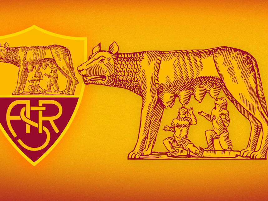
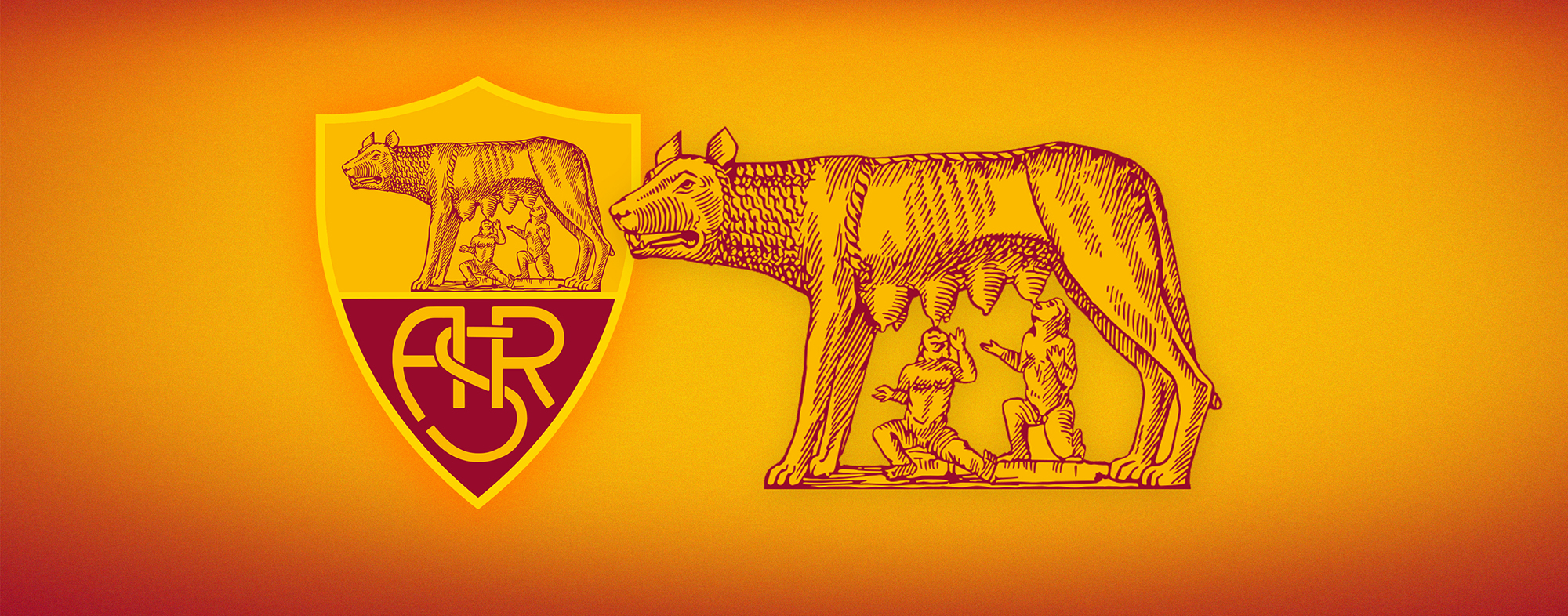
- Redraw the Lupa Capitolina – always going to be the main part of this logo design, and very much in need of an update, it has to be said. But I think they’ve gone too far away from what it was previously, and recreated it in an overly simplistic and almost cartoon like style. It needed more graphic detail and effort with more emphasis on shading to give it some depth. The use of more strokes and lines, either directional or cross lines, would give it more of a detailed look. The 15% grey colour is poor whereas white would have worked better (as I demonstrated earlier), or a metallic silver highlighted with a shine, or perhaps even an emboss for a 3D feel to make it stand out more.
- Replace the ‘ASR’ with simply ‘Roma’ – clearly done to get the message across straight away. Not ‘ASR’ but simply ‘Roma’, the city, the history. “To tell who we are”. I understand the thinking, but in my view it is the biggest flaw of the new logo and completely disregards the history and the heritage of the club, that which represents how the Associazione Sportiva was born.
- The font. Again, I understand what they intended with this, and to an extent I agree. The aim is to use an old style serif font to represent Rome historically, classically, eternally. I liked the ‘ASR’ design from before, but from a design point of view the modern (custom) san-serif font of it didn’t fit with the rest. For the new ‘Roma’ they’ve used the typeface Trajan Pro, a popular classical serif font. I would have tried other fonts, and I say they did, in fairness, its just if you were typesetting the word Roma, Trajan Pro is probably one of the first fonts you’d try, and so when presented it was probably the one which was picked first. To be honest, the more I look at it, the more I think it fits with what they were trying to do and isn’t the worst. It will just need to be seen in other ways such as promotional material and merchandise.
- The 1927. A nice addition. Fits nicely under Roma. They grey colour – the same as the she-wolf – is poor, though, and grey on a dark shade of red just doesn’t go. Would be better in white. Also no need for a drop shadow on it, and on ‘Roma’, as it gives it a worn look.
- The white border gives it a strong feel and presence about it, although not sure of the equal black then white border. Also remains to be seen it both borders will appear all the time (background colour permitting), such as on the maglia, as the official wallpapers released don’t have the white.

Overall, I’ve gotten over that initial feeling of shock at seeing the new logo, and while I can’t say I really like it, I can’t say I completely hate it either. On a positive note I have to say it does look more contemporary alongside the previous logo, at least in terms of how football crests are these days, and one nice change is bringing the Lupa Capitolina lower down on to the red which adds some depth.
I still feel that it all seems a bit rushed and that more time and several more drafts and critiquing of it would have paid off in the long run. Not to mention some fan consultation and feedback, which hasn’t happen whatsoever and will no doubt lead to protests (see here).
The blatant disregard of ‘AS’ from the original logo is without doubt the single biggest flaw in it and will remain a torn in the side for a long time to come. The timing of it is also curious, only a few days before the Coppa 2013 finale, and I can’t see why it couldn’t have waited until the season was officially over. It could have been worse, for sure, but it could have easily been an awful lot better.