
This is a guest post by Sligo-based designer and illustrator Dan Leydon, whose previous work includes Player Portraits, BT Sport Champions Draw, I See Football Everywhere, to name just a few. Dan regularly works for clients including Nike, New Balance, BT Sport, NBC, Paddy Power and Bleacher Report. Check out more of his work on his website danleydon.com or on twitter @danleydon.
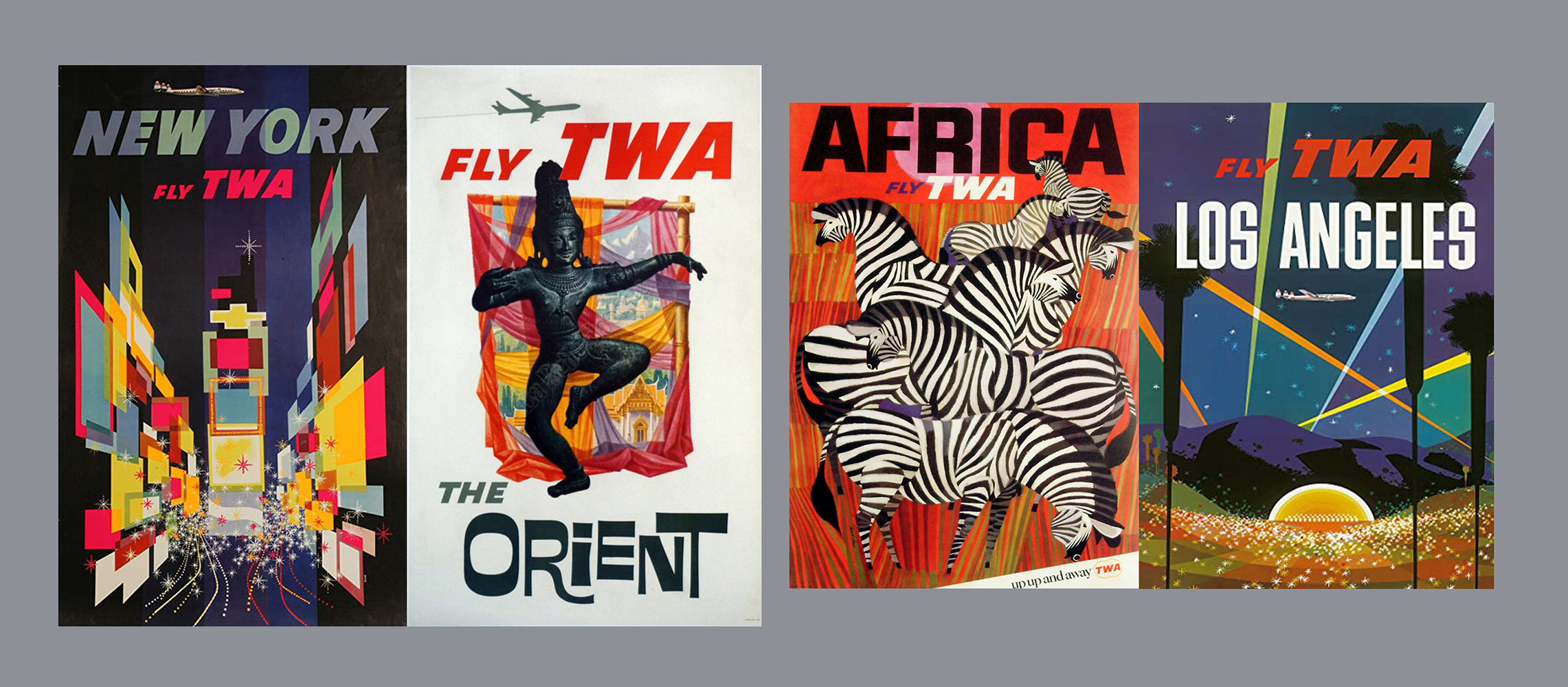
As 2020 descended into a global state of isolation and restricted movement, my plans for an extended trip found themselves in tatters. With international travel a non-possibility, closely followed by the halting of the football season, two major interests were, for the first time, off limits. Due to the extra time found in each day, I could dedicate much more energy than usual to drawing and developing artwork. After a few weeks of doodles and dead ends, I was browsing old TWA travel posters and thought why not develop my own set? When ease of movement has returned football tourism will be booming once again. I would count these posters as alluring examples of what will be available again, hopefully sometime soon.
My method consisted of isolating a list of cities that were viable; I find places with associated iconic imagery lend themselves to this work very well. Then I fill pages and pages in my notebook listing off landmarks, sayings, foods, anything that’s instantly linked to the place in the publics mind. I make doodles of layouts, tweak colours, then return to the piece a few days later to see it with fresh eyes.
As the project progressed I settled on 8 as the optimum number for the full set. Looking back on the finished work, various threads progressed throughout the process. The first was the style and detail of the artwork, I began with an urge to give people something similar to those TWA posters produced in the 60s and 70s. As I kept creating new pieces the posters became more conceptual. Things swung from illustration to design.
Another thread was the actual geographical choices. As the posters were made they started in mainland Europe, with all the usual choices but then I started to expand my horizons. I included New York and then Tokyo, places where football is not your instant association but it certainly has passionate followings and is always growing. I also moved away from using individual players to presenting a city in which many football options are available.
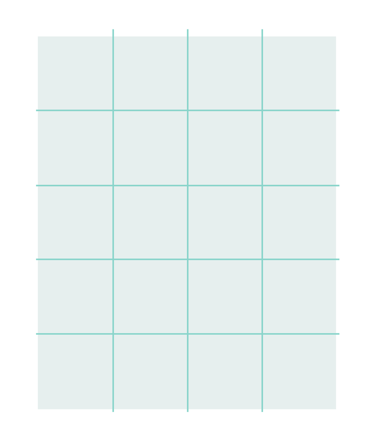
To ensue any work created could sit on social media as well as in a frame on a wall I made sure to work within a 4:5 grid as this is currently the most vertical you can get on Instagram.
The approach to poster layout of Paul Rand and Saul Bass has always inspired me to keep drawing, keep developing and most importantly to keep experimenting. With experimentation firmly in mind I set to work to see what I could make. This stage of a project always gives me a sense of freedom and possibility to such an extent that I wish everyone could experience it.
The entire project needed a uniform visual language that I could stretch and twist but ultimately adhere to. I decided all posters needed a city name, an aeroplane graphic, a tagline and an illustration or graphic symbol to represent the overall idea.
Colour schemes could be developed as the pieces progressed. My process involves constant experimentation and use of overlay layers at various transparencies, I’ve never been a designer who sets their colours in stone at the beginning and carries it off to perfection in that way. Following my gut and shooting from the hip seem to suit my style much more. I try to get feeling and the sense of the hand at work into each piece, I feel it transfers energy to the end product. I like to produce work that people can chew on.
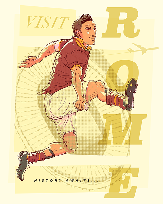
The project started with Rome. Developing an illustration and then viewing it as an asset to be used within a larger layout was something I had wanted to get better at. The last few years I’ve been working hard at developing my drawing approach. I’m inspired by the likes of Egon Schiele, Sergio Toppi, Victoria Semykina and Quentin Blake amongst others. What I’ve found is that I enjoy exaggerating limbs and quite enjoy drawing the human form. The expressive style of the drawings can be paired well with strong type and this is something I wanted to employ. I chose Totti and wanted to play on the image of Rome as great place to go for history fans. He’s now retired and I wanted to portray him as one of the historical wonders of the city. A large part of this project was using the players as the landmarks as they are what football fans are really traveling to see. Using the ‘O‘ in Rome as the ball he’s plucking out of the sky is the type of detail I like to incorporate into my work, anything that can enhance the relationship between the elements of the piece whilst amplifying the base message.
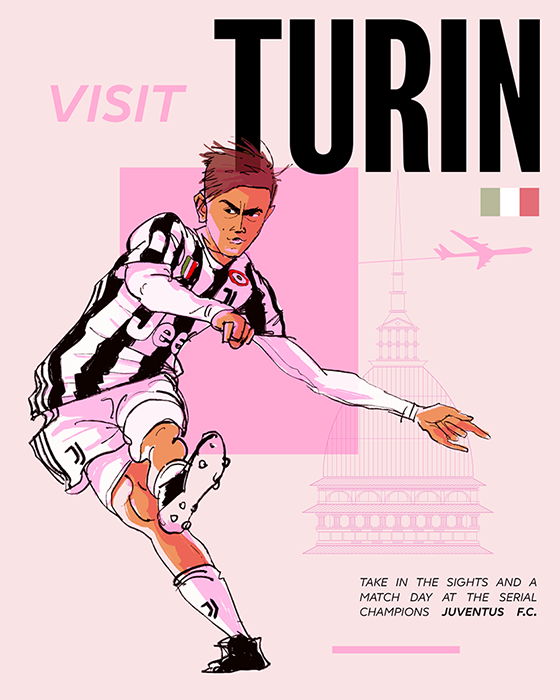
With Turin I let loose and addressed the various assets within the piece in a way that suggested vintage film posters. Studying the art of Bob Peak really helped me find a balanced method here. The line work is more muscular than the Totti in the previous piece and this strength allows the image to sit apart within the overall composition, rather than being woven into the piece. It’s stark and this helps with balancing the fragmented surrounding elements. I think the saturation of Dybala’s skin tones really set the piece off.
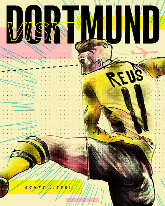
The atmosphere is the first and last thing I associate with Dortmund; the Yellow Wall chanting tirelessly from before the start to after the finish. BVB ultras generate this electricity, it’s undeniable and I wanted to capture the feeling of an avalanche of noise coming right at you. This poster has more melding of elements than the rest. Boxes are saturated by encroaching line work and that jaggedness allows a sense of movement essential to capturing the atmosphere. The use of the illustration here is a lot more dynamic than the previous posters. Cropping into the work lets us feel like we’re closer to the action, Reus is only in our line of vision for a split second, he’ll be gone soon.
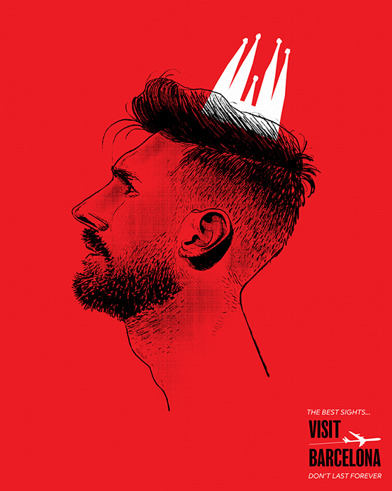
This is where the series started to get more conceptual. I was inspired by Paul Rand’s approach and knew there was a collection of iconic imagery associated with Barcelona ripe for appropriation. Messi is really the crown jewel, for the club and for the city. Unlike architectural landmarks he is finite and as sad as it is, we are nearing the end of his career. I arrived at this combination by doodling the landmarks dotted around the city. When I’m happy with an idea like this I find it’s better to give it centre stage and do it’s thing, much like managing Messi I imagine.
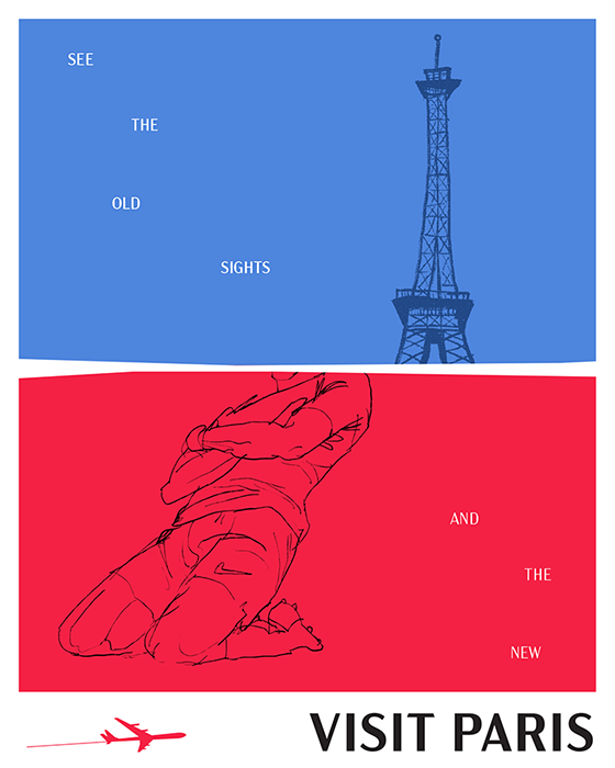
Taking heart from the more focused approach of the previous poster I wanted to use the landmarks of the city and give them equal billing with Mbappe, another Parisian icon. He’s already achieved that status where people will know him by only seeing a portion of a photo so I gave him and the Eiffel tower the same treatment and presented the work in the appropriate colours. Again inspired by Paul Rand I used the placement of the individual tagline words to guide the eye through the piece.
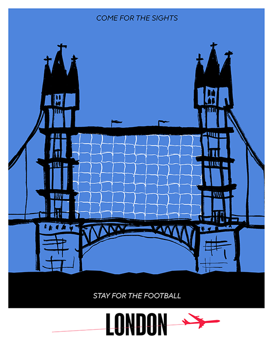
London has so many football clubs I couldn’t pick just one so I used a landmark, Tower Bridge, as a stage for a rogue football element, nets. Using black and white was important as it starkly separates the two. Adding to the uniformity I used the tagline that alludes to each element in the colours of that element. It’s nearly insignificant but it amplifies the story telling within the piece if even a little bit.
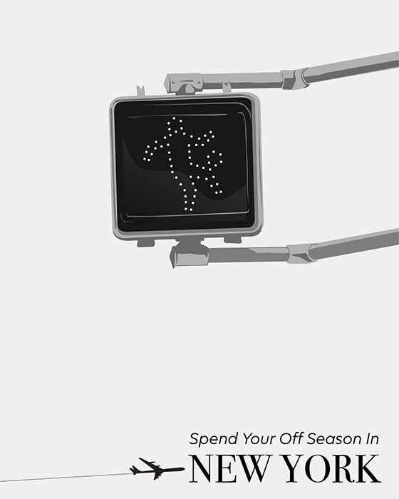
New York has had a tenuous connection with soccer for many decades with the initial interest in the New York Cosmos significantly dwindling away. In recent times things have changed with two MLS clubs proving popular within the city. I felt approaching the city in a broader sense would pay off, as opposed to zeroing in on any one player or club. If an existing iconic element can be tweaked slightly in the pursuit of amplifying a specific connection, like soccer and New York, then I find it has much more impact than other more time intensive avenues. With a slight bit of rotation and the addition of a ball, the crosswalk symbol could be turned from a New Yorker pounding across an intersection to a New Yorker doing keepy ups. This type of thought process was useful in the next and final piece in the series.
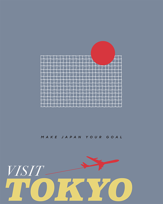
Tokyo and the surrounding area is home to many football teams and I wanted to reimagine some iconic Japanese element in football terms. I cycled through cherry blossoms, pagodas, torii gates, mount fuji and many others. Then the alluring red circle in the national flag spoke to me. From the Rome poster to this, my method became more and more focused, to the point that all I’m left with are the most basic elements of football; a net and a ball.