‘MY NAME IS MY STORY. I M FC INTERNAZIONALE MILANO…’
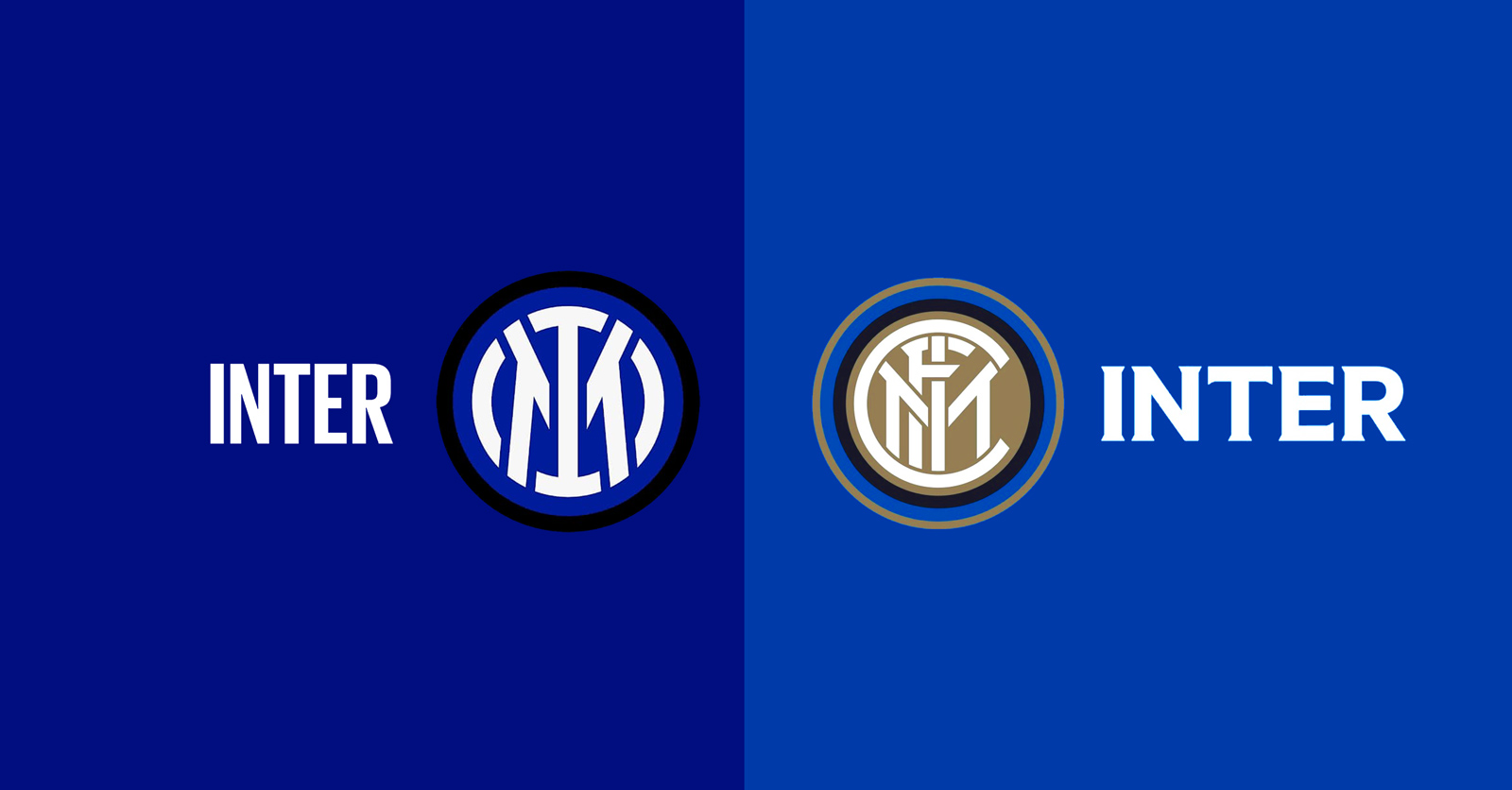
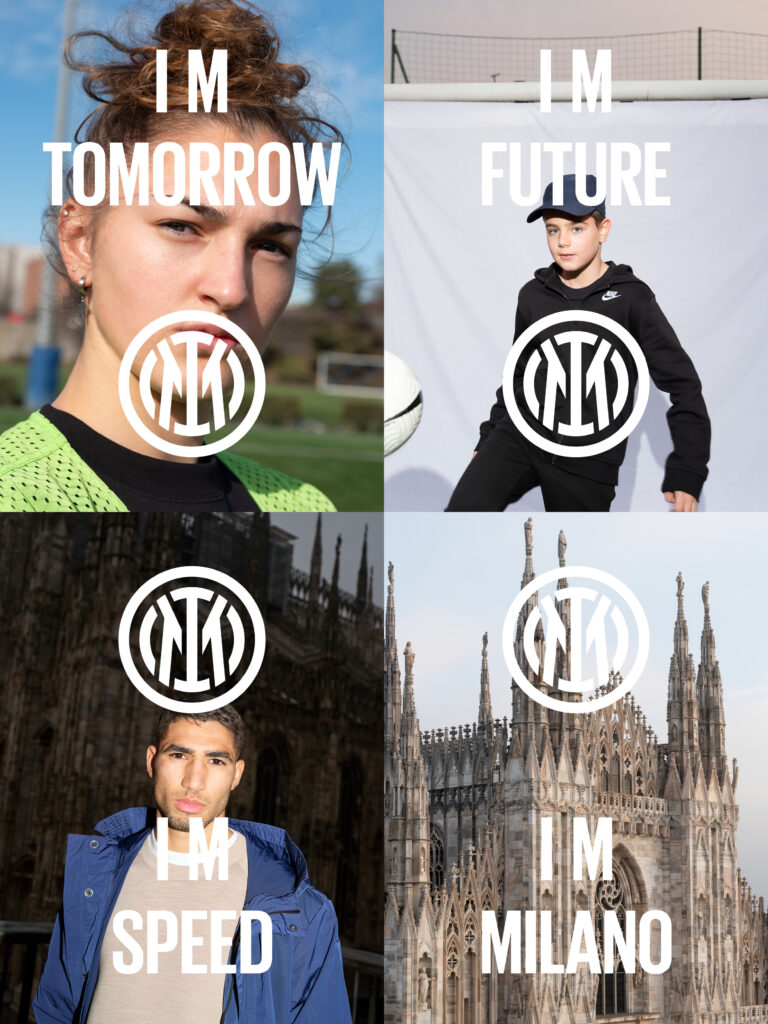
Inter look to the future as they present their new logo which will be used as of the 2021/22 season, relaunching the football club as a global brand. ‘My name is my story’: the I and M are stylishly intertwined with a double circle around it, a new visual identity linked to the past and the city of Milan. The launch of the new logo has been celebrated with a narrative that plays on the initials of the club’s name – I M, from Internazionale Milano – to harness the English expression “I am”, a focus of the new brand campaign.
The new brand identity also brings with it a new blue for the Nerazzurri, with a darker royal blue alongside the black. The brand campaign emphasises the meaning behind “IM”, suggesting that it is a symbol of freedom of expression, and that the club’s values and their evolution can be found within. It embodies the next generation and openness to the world, passion for football, and the ability to inspire beyond the field of play.
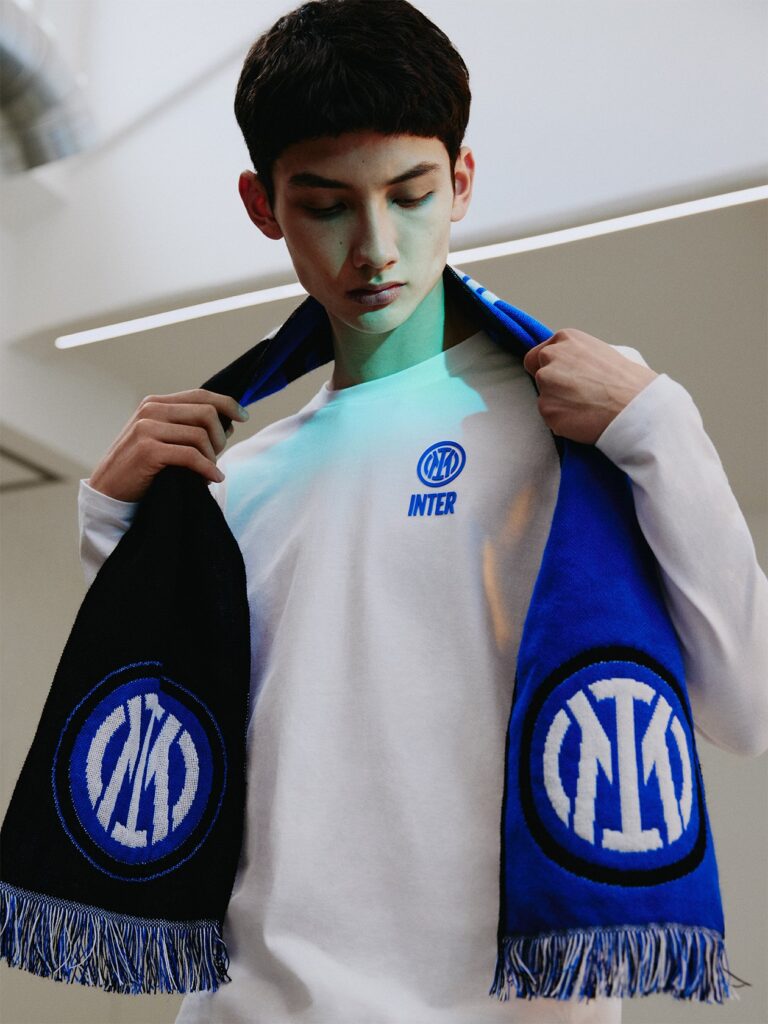
The first match with the new crest will be in 2021-22, but Inter fans will be able to see it on the players tracksuits during the warm-up for Inter-Cagliari on April 11, some of which you can see below. Notably, there isn’t a gold star present and the design is more minimal.
The new logo is more of a modern reinterpretation of the club’s historic symbol, in a more streamlined and minimalist guise. While maintaining continuity with the original version, the new symbol is a more suitable fit for the age of entertainment.
The evolution draws a great deal of inspiration from the club’s roots; the founding values of Inter remain front and centre, preserving the historical and emotional spirit with which its most loyal supporters identify, and emphasising the bond with the city of Milan. This bond is about more than Milan being the home of the club, because Inter also embodies the city’s values: the international spirit and the predilection for innovation and continuous change, without betraying its essence.
The focus is on the letters I and M, which have been preserved from Giorgio Muggiani’s original design and are framed by the classic concentric circles, as per Nerazzurri tradition. The letters F and C, meanwhile, remain in the name and identity of the club: FC Internazionale Milano. While the logo’s graphics have been streamlined, amplified are the areas in which Inter will be able to develop – a football club, but not only that. The colours remain those chosen on the night of 9 March 1908, made more vibrant and vivid.
To discover more and see Inter’s new interactive website on the visual identity change, visit here.


