
New crest to be used at the start of 2022/23 season

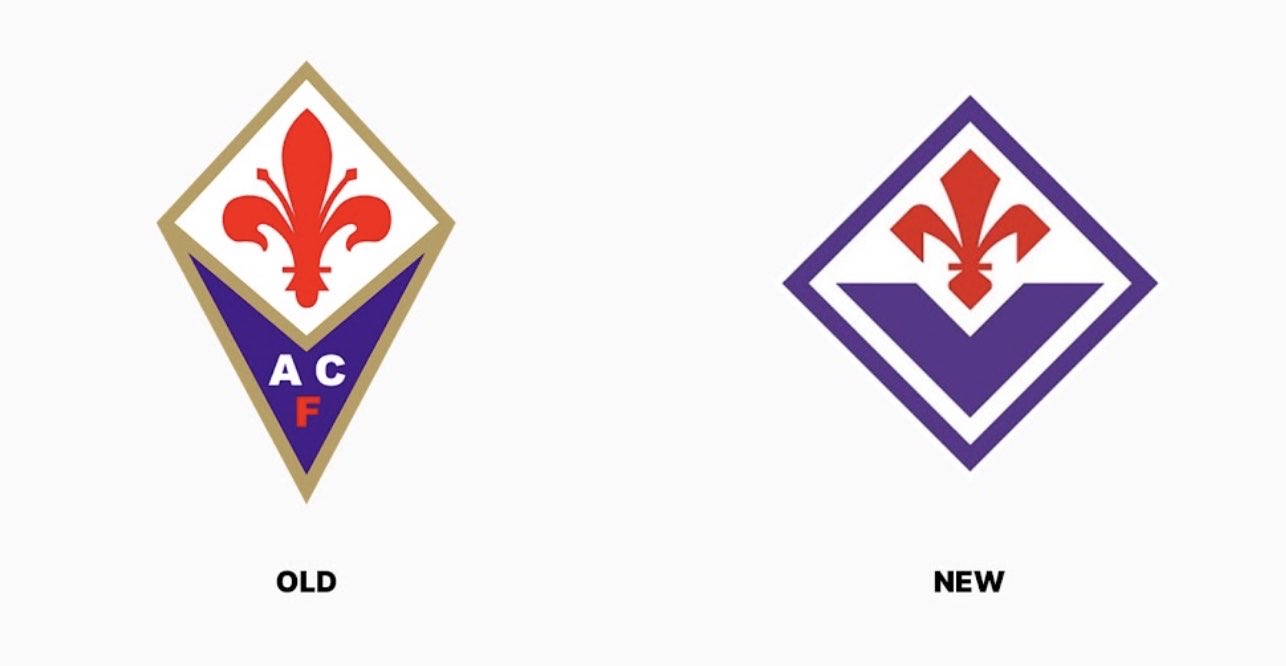
Serie A side Fiorentina recently unveiled a controversial new club crest. Consisting of a diamond shape bordered in purple and white, with a purple V at the bottom and the iconic red Giglio (the city’s symbol) at the top, it will be used starting in the 2022-23 season. The crest was developed by London-based international creative agency FutureBrand, along with a new visual identity and manifesto for the Tuscan based club.
We are I Viola 💜#playtobedifferent pic.twitter.com/m6d5a0U9L3
— ACF Fiorentina English (@ACFFiorentinaEN) March 25, 2022
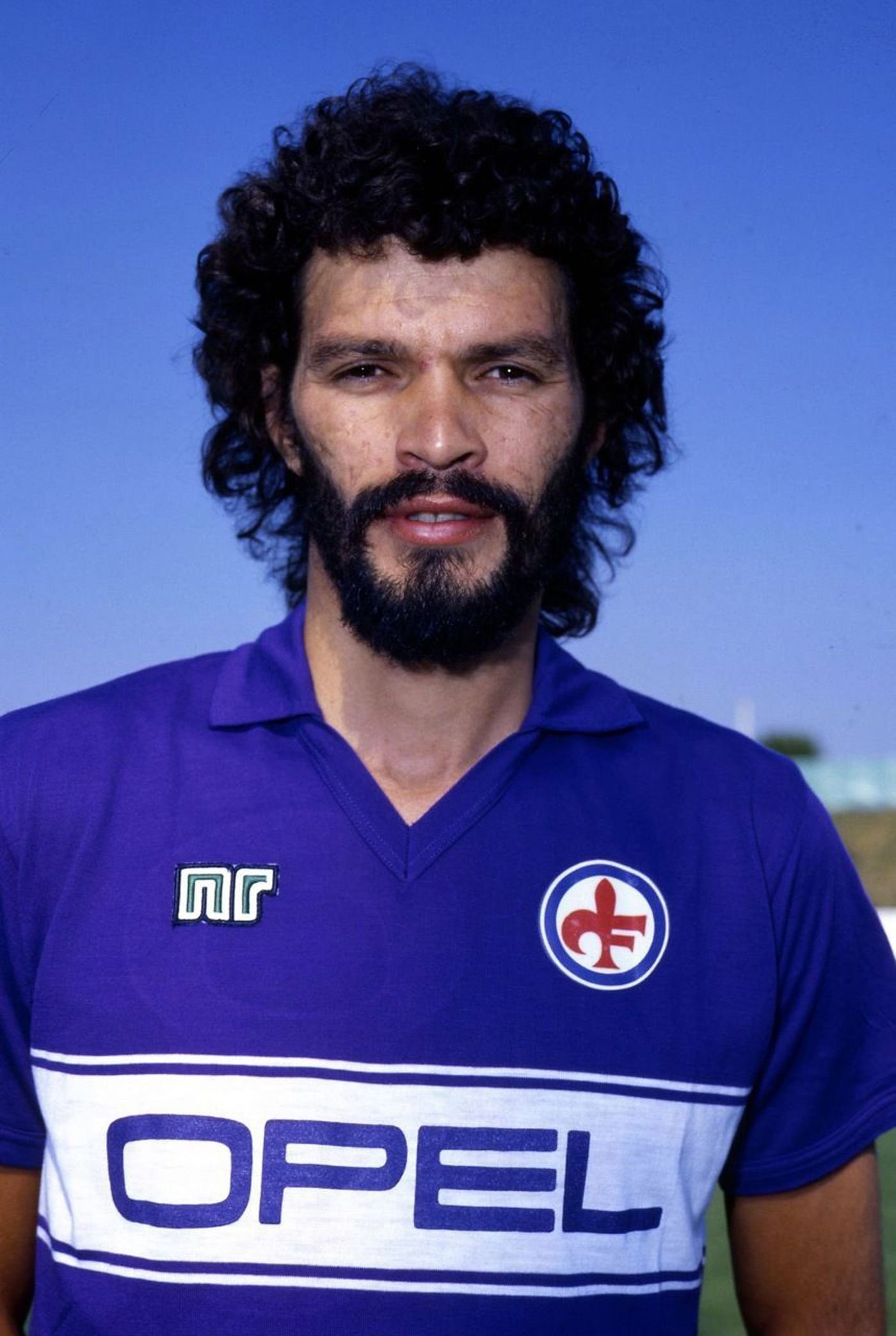
While there was initially an outcry of ‘what have you done!’ on social media, as well as fans in Firenze protesting with banners outside the club’s grounds, this isn’t the first time the club has changed its crest in the past. Indeed, they recently reintroduced the famous ‘giglio’ circular crest for one season, a throwback to the 1981 classic as worn by Socrates.


When seen in these terms, it actually doesn’t seem all that bad, and indeed perhaps is an improvement for the new digital and social age. Yes, tradition needs to be respected, and while the old crest will always hold a lot of sentimental value for fans, the new one isn’t entirely dissimilar. The one thing the club could have done is a process of engagement with the fans. Rather than simply a surprise announcement, which never goes down well with hardcore tifosi (see: Roma), involving them from the start and gathering feedback would’ve been a much smoother process to such an important change.
“The club’s ties with Florence and its glorious past are represented by a red lily, inspired by the one introduced in 1957 and worn by the Lions of Ibrox when we won the first Cup Winners’ Cup in 1961,” the club’s website reads. “It is a modernised red lily like the red lily of Florence but whose shape goes back a long way – possibly directly to the founder and first president of the club Luigi Ridolfi. Reports from the time suggest he designed the original crest which adorned the team’s jerseys until the Mitropa Cup triumph in 1966.”
The V, rendered in ACF Fiorentina’s signature shade of purple, “is now a central feature in the club’s logo, symbolising the union of all ‘Viola’ on and off the pitch. Fiorentina’s real strength. The V of the Viola is also given prominence architectonically at Viola Park, where the club’s new visual identity will be in full view.”
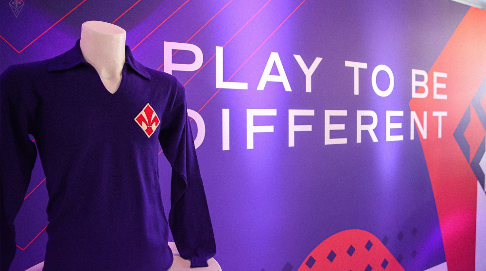

Along with the new crest, Fiorentina released its first-ever manifesto, “statement of the club’s identity and its deep roots but also a commitment that the Viola’s football should always be distinctive, authentic, close to the people, and represent the beauty of Florence and the passionate, nonconformist spirit of the Florentine people, ambitiously striving for a new football Renaissance.” From this manifesto comes the club’s new slogan: “Play to be different”, now used with all social media posts.
It’s an exciting time in the history of Fiorentina, with ambitious new owners who have brought a fresh new identity to the club, and their intentions do seem to be in the right place. Plans for a grand new Artemio Franchi stadium in the city were also unveiled last year, although that may have stalled in recent times thanks to the notorious influence of Italian bureaucracy and all the trouble that brings. As for the clubs new look, as ever, when it comes to new branding and a new club crest, only time will tell if the fans can be won over.
