
 CHANGING OR UPDATING a football clubs crest/logo can be a touchy subject. In many cases, club crests can be old and dated looking, but with the ever advancing marketing and globalisation, if you like, of the modern game, many football crests have been redesigned to better reflect the ‘brand’.
This, of course, can be met with outrage and controversy by fans, as with most things design related people can be afraid of change. And for just reason. Culture, history, location, art, representation, identity; all ideals which must be respected. Most clubs get it wrong, at least at first, but some manage to get it right. Which ones do is up to you, the fan.
Old crests small and on the left, new crests on right and larger. Click on each to see bigger. Check back for future additions if and when clubs release new crests for the 2013/14 season.
Bolton Wanderers

A redesign of a redesign, Bolton’s new crest merges aspects from their previous, much disliked (old) crest – complete with its ‘Reebok ribbons’ – with an older and much more popular crest from the 1970s. The new design comes following feedback from fans who expressed a desire to see the club’s history reflected in the new-look crest, hence the reintroduction of the Lancashire rose and a more traditional overall shape of the crest. Good to hear clubs listening to fans, for once.
Official speil:
The more modern, cleaner and dynamic design has been created following feedback from supporters, who expressed an overwhelming desire to see the long history of the club reflected in the crest. The new design sees the reintroduction of the Lancashire rose alongside the founding year of the club, 1877, in a reworking of the club’s popular crest from the late 1970s.
The new crest’s compact design means it will be reproduced both more effectively and more prominently on a variety of Bolton Wanderers elements. The existing ribbon-style crest that was introduced following the move to the Reebok Stadium in 1997 will remain in place as the club’s stadium crest.
EPS / SVG / high-resolution of crest here.
Crystal Palace

Crystal Palace revealed what is its ninth different club crest in its 108 year history, but its the first redesign since 1994. It was put to a vote amongst the club’s fans, and the winner was one designed by one of its very own supporters, who was assisted by club’s own design studio. It was a unanimous success, with over 90% of Palace fans saying they like the new design.
Crystal Palace’s new crest goes to show that with the right approach and careful planning (vice-chairman Steve Parish said talks to release a new crest start almost two years ago), it is possible to get it right and everyone can be happy. The marketing people have their new updated ‘brand’ and, most importantly, the wishes of the fans have been listened too.
Official speil:
Mr Parish said: “When we put a number of badges to vote a year ago we received a real cross section of opinion and have taken these views on board. The badge has been designed by one of our supporters, Dan Mulcahy, assisted by the designers at CHI and partners and Robert Deacon in the club’s own design studio.
“The new badge has been designed to be able to be used in different ways. The crest will be seen with a shield in a ‘coat of arms format’ around the stadium, without a shield on the club kit, on training wear and in the media. This new design will re-produce much better than the old line drawing, featuring a stronger more dynamic eagle that brings our club image into the 21st Century.”
EPS / SVG / high-resolution of crest here
Everton

Unlike Crystal Palace, Everton are a perfect example of how clubs can get it so wrong. Everton unveiled its new crest in May – and were immediately hit by a backlash from furious fans, with some labeling the tower a “hobbit house”. The club’s Latin motto Nil Satis, Nisi Optimum, which means “nothing but the best is good enough”, and two wreaths were removed in the new design, leading to more than 25,000 Evertonians signing a petition in protest.
In fairness to the club, they at least were taken aback and apologised for not properly consulting with fans and said that the new crest will only be used for one season and that supporters will have their say on the new crest for 2014/15. Yes, they may have had a need to ‘modernise’ (silly jargon term) their crest, but fans should be consulted first, and a direct result of this is that most Evertonians have said they will not waste their money on their teams new jersey with this new crest, costing the club a lot merchandise sales in the process.
Everton fans are extremely proud of their clubs 135 year history and heritage, and rightfully so, so it was quite a blundering and you can’t help but feel rushed oversight for the club to disregard the aspects of the crest which represent that history and heritage.
Official speil:
Everton’s new crest combines four historic elements of the previous badge – the Tower, the shield, our name and the year of our formation – to form a concise, modern and dynamic representation of Everton.
From the very outset of a process which began in Autumn 2012, the Club’s in-house design team talked to fans about our Crest, its significance, its meaning and the importance of the individual components.
The updated Crest now boasts a more realistic version of the famous ‘Everton Tower’ as its centrepiece and the modernised design prominently features the Everton name. Its simplified nature means it can be reproduced more effectively in the digital and retail arenas.
EPS / SVG / high-resolution of crest here: N/A (can’t find, unlikely to be available due to fact no one likes it)
AS Monaco

New rich kids on the block AS Monaco, fresh from dropping €50m+ on Falcao and lots of other players you will no doubt facepalm when you hear they’ve signed them, released a new version of their logo, which is really just a refresh of their old one. The basic structure and the content remains the same, with a modernised (there’s that word again) fresher look of the crown as well as a simple and clean gradient effect added to the red strips. ASM also becomes AS Monaco FC. It does stick fairly close to the old one, which is the safe road to take.
Official speil:
EPS / SVG / high-resolution of crest here
OGC Nice

A complete redesign from the French Ligue 1 club Nice, ditching the outdated and old school football and red circle as well as the the reference to the Côte d’Azur. The eagle is made much larger and now becomes the main outline of the crest, with the clubs name also more prominent. A much needed update considering how old the previous incarnation looked, but they’ve gone with a pretty templated formula when really there was potential for a much nicer crest.
Official speil:
EPS / SVG / high-resolution of crest here
Paris Saint-Germain Crest

PSG change their crest more often than Palermo change manager. Well, perhaps not that much, but this latest PSG crest is their seventh offering to date, which is ridiculous when you consider the club was only founded in 1970. Now one of the mega-rich playthings of some rich people alongside AS Monoco, you can start to see a trend revealing itself with these new foreign-owned clubs. Hire marketing experts, redesign your ‘brand’, push it globally.
PSG’s new crest is an update of the previous version, with brighter colours used, a stronger structure to the name (done intentionally to “capitalise” on the city itself), and more emphasis on the fleur de lys emblem.
Official speil:
PSG’s new logo represents the positioning of the club around the heritage of excellence that Paris has come to embody along with its two universal values – ethics and aesthetics. PSG has chosen to capitalise on the strongest element of the brand, namely Paris itself.
The city of light, which is an undisputed icon throughout the world, represents unparalleled leverage to propel Paris Saint-Germain up among the greatest global sporting brands. The new logo thus has the name “Paris” clearly brought to the fore, with the Eiffel Tower at the heart of the logo. The base of the logo has the name “Saint Germain” which continues to be associated with the brand, along with the fleur de lys emblem.
The logo has a greater synthesis of ideas and a more immediate impact, and is now ideally placed to capture the imagination of football and sports fans around the world.
EPS / SVG / high-resolution of crest here
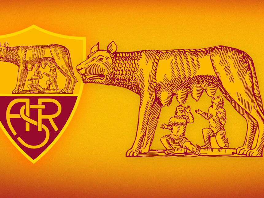
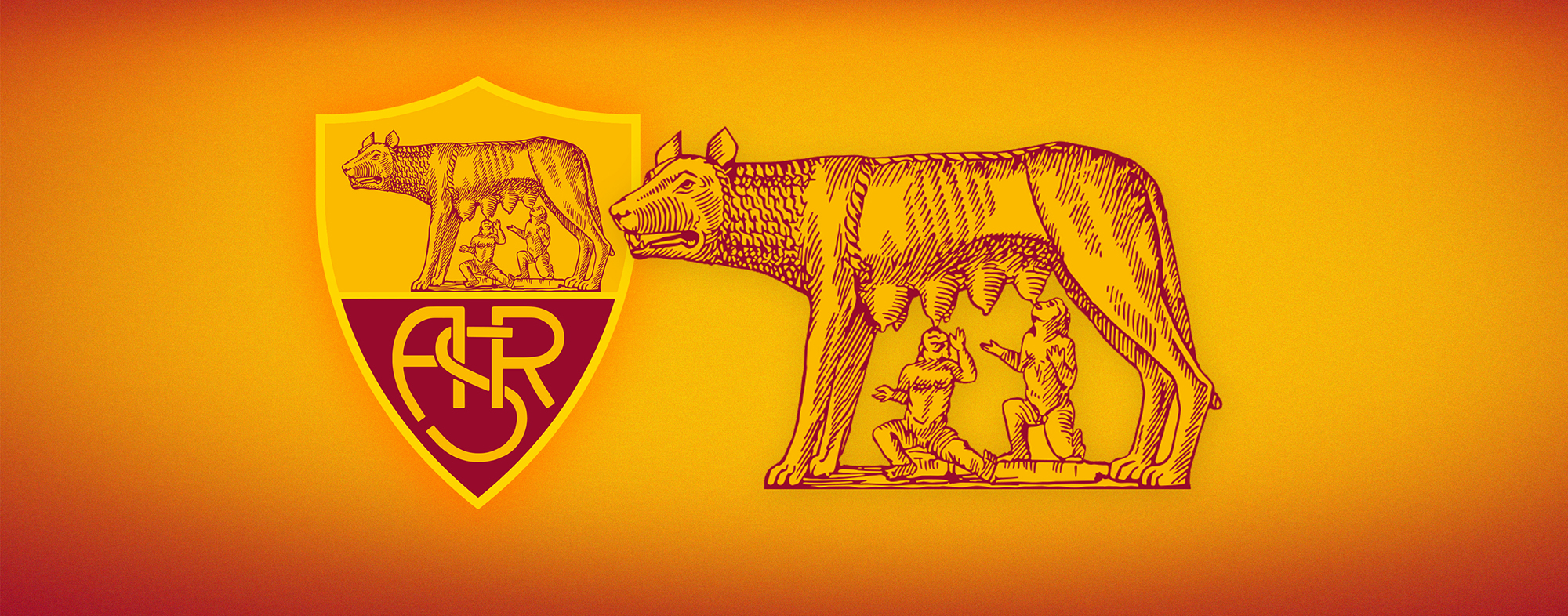
AS Roma

Where to start? This is a redesign I discussed in some detail before , so I won’t go into too much design detail here. Similar to Everton’s new crest (above), lets just say it wasn’t too welcome by the majority of the tifosi. Outcry over losing the ‘ASR’ and the redrawing of the Lupa Capitolina, however subtle, caused consternation amongst some of the more hardcore element of Roma’s fans.
There are similarities to PSG’s new crest and the reasoning behind that. New foreign owners want to “make the club the biggest in the world”, hire marketing experts, decide to “capitalise” on the name: in PSG’s case, a bigger ‘Paris’, with a more highlighted Eiffel Tower; in Roma’s, the replacement of ‘ASR’ with simply ‘Roma’. The intention is clear enough, change the brand to make it more identifiable to people around the world that this is Roma or this is Paris. Just in case you were a confused tourist visiting Rome for the first time and thought ‘ASR’ stood for Arse Society of Rome, or some such nonsense.
Again, similar to Everton, this is very much a case of a club getting it all wrong. I’m not arguing that a new crest wasn’t required. I can understand the need to update and refresh it (particularly the Lupa Capitolina), but it was the process which was muddled from the off. Released as a surprise with only mysterious countdown images released each day through twitter, and shockingly, done so only a few days before Roma’s biggest game of the season in the Coppa Italia final, the timing was just plain awful.
Worse than that, though, was the non-consulting with any fans or those close to the club. This was made particularly worse by the views held by some fans of the brash, Boston-based foreign owners changing the clubs identity on a whim and showing a lack of respect for the history and tradition of the club. There was some initial reaction from the clubs management on changing it, but unlike Everton, no apology was issue and, unlike Everton, there are no future plans to change the crest or listen to the wishes of those who matter most, the fans.
Official speil:
1) Historic Shape of the Shield – The updated logo maintains the shape and proportions of the original AS Roma crest, represented in art and sculpture throughout the city. The additional black line in the middle provides a stable base for La Lupa Capitolina and her twins.
2) Traditional Red and Yellow Colors – The classic color palette, which evokes the colors of Rome, remains and will continue to pay tribute to the community that the Club represents.
3) La Lupa Capitolina with twins Romulus and Remus – The Club that represents Rome is inextricably linked with the birth of the Eternal City, founded 2,766 years ago. We continue to honor the icon
EPS / SVG / high-resolution of crest here
Check back on this page for more updates if and when European clubs release new crests for the forthcoming season.