
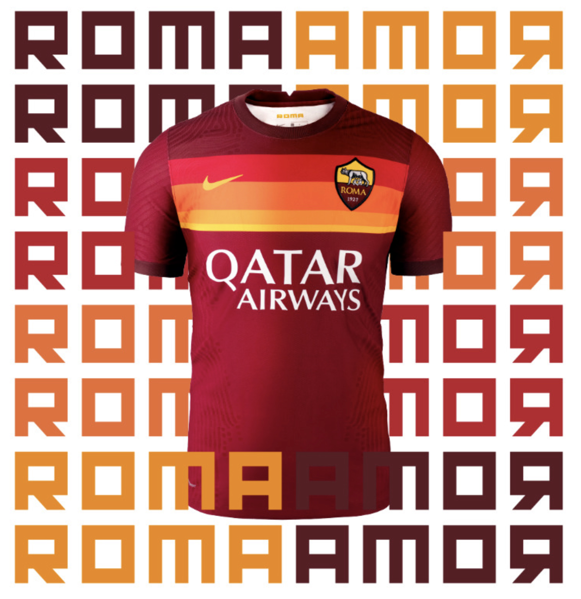
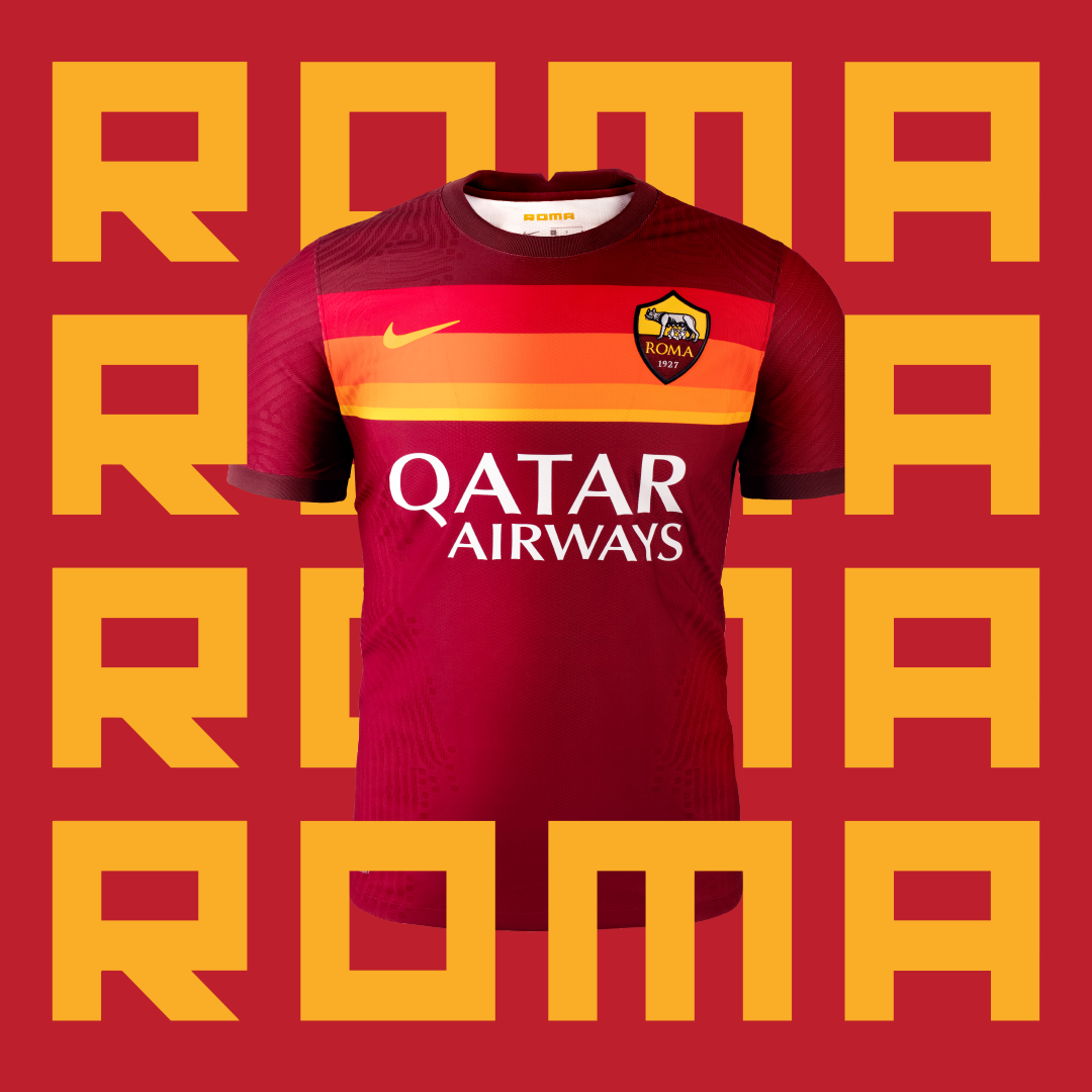
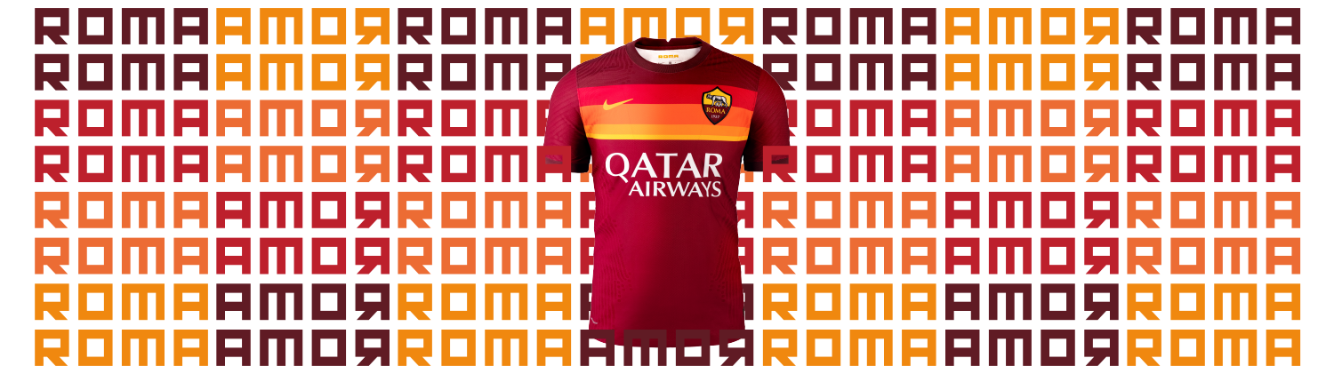
In what will be Nike’s final year as kit supplier for the capital club, AS Roma have unveiled their much anticipated new home kit for 2020/21
AS Roma recently announced their 10-year partnership with kit giants Nike will come to a premature end upon completion of the 2019/20 season – with an additional agreement which will see Nike provide the club kits for upcoming 2020/2021 season (see: ranking all AS Roma’s Nike kits). For 2020/21, Nike decided to revisit an historic Roma design to create their last ever Roma home kit, a kit which is uniquely, unmistakably and gloriously Giallorosso.
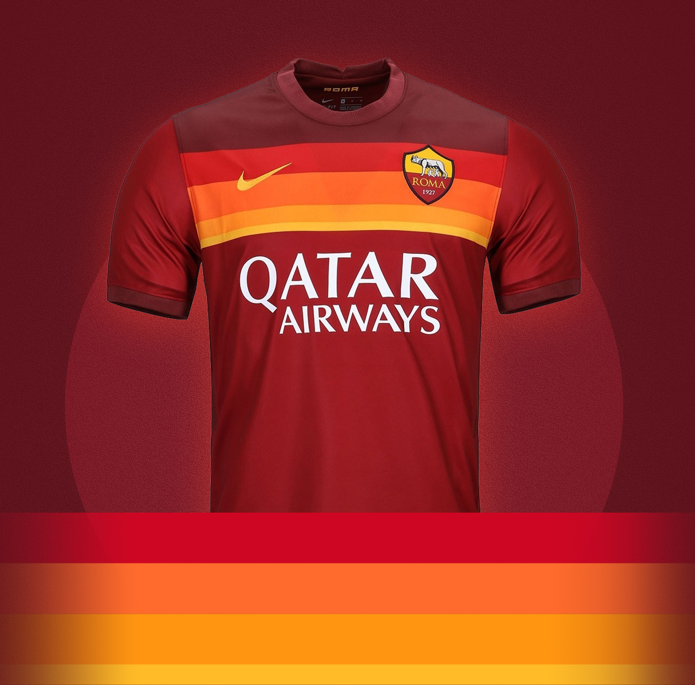


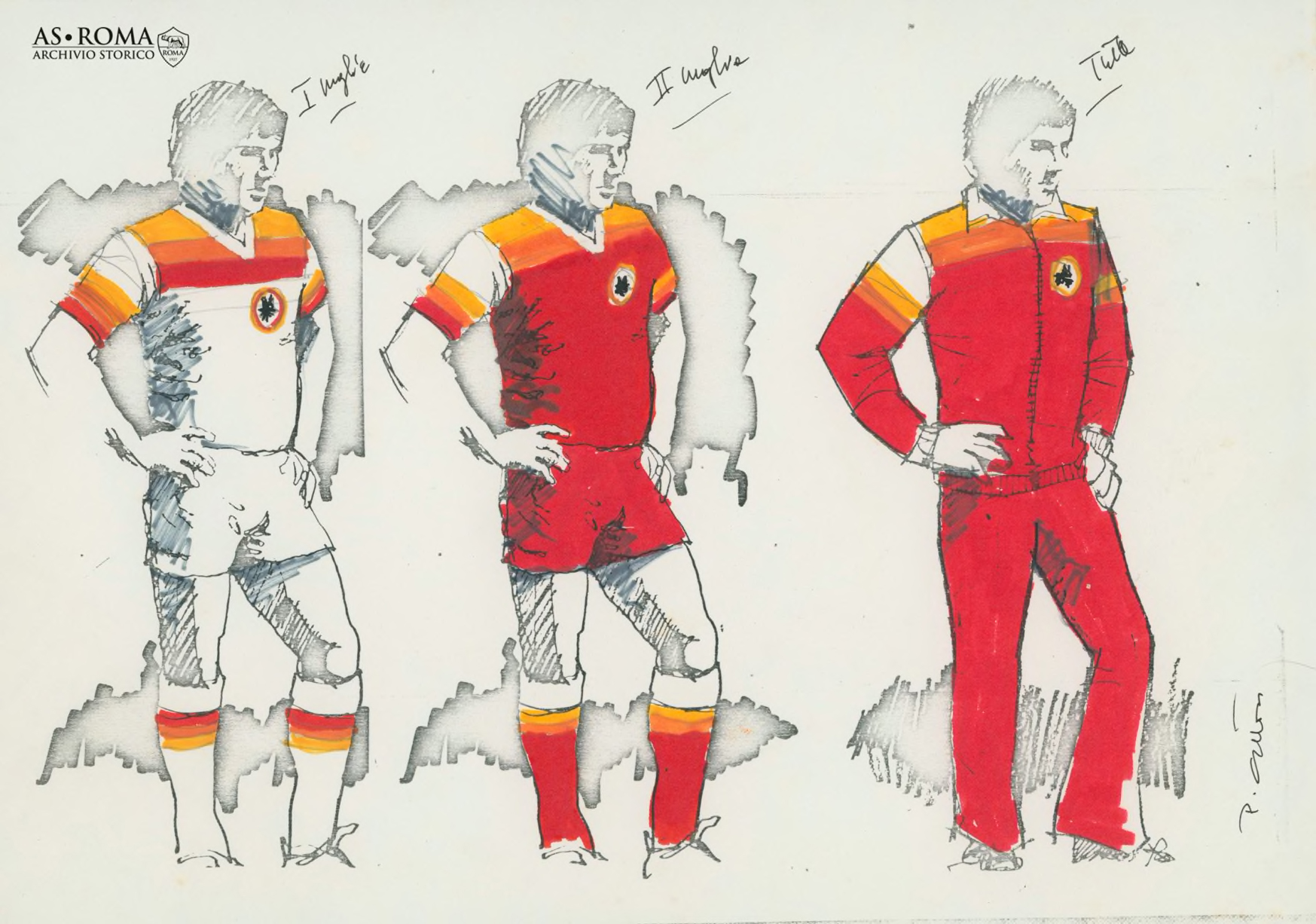
Following on from last seasons retro throwbacks, Nike have once again looked to the past for design inspiration, with the new home kit being loosely based on the classic 1979 ‘lollipop’ (or ‘ghiacciolo’) kit designed by Piero Gratton, was sadly passed away earlier this year. The story of the much loved ‘lollipop’ kit is one straight out of Roman folklore, with revolutionary Roma President of the time Gaetano Anzalone making waves by introducing a radical new kit (and logo) at a time when marketing of kits in Italy was unheard off. That ’79 kit itself was inspired by how sports teams in United States in the 1970’s promoted and marketed their apparel, and in particular Anzalone and Gratton took inspiration from the Houston Astros’ 1975-80 ‘tequila sunrise’ outfits. And thus a legend was born.

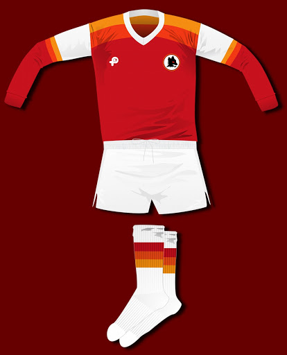

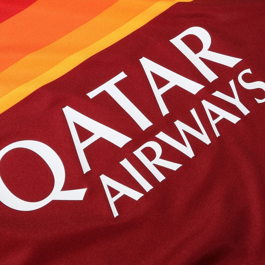
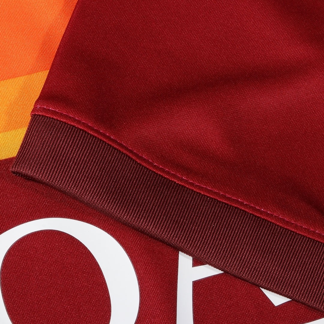
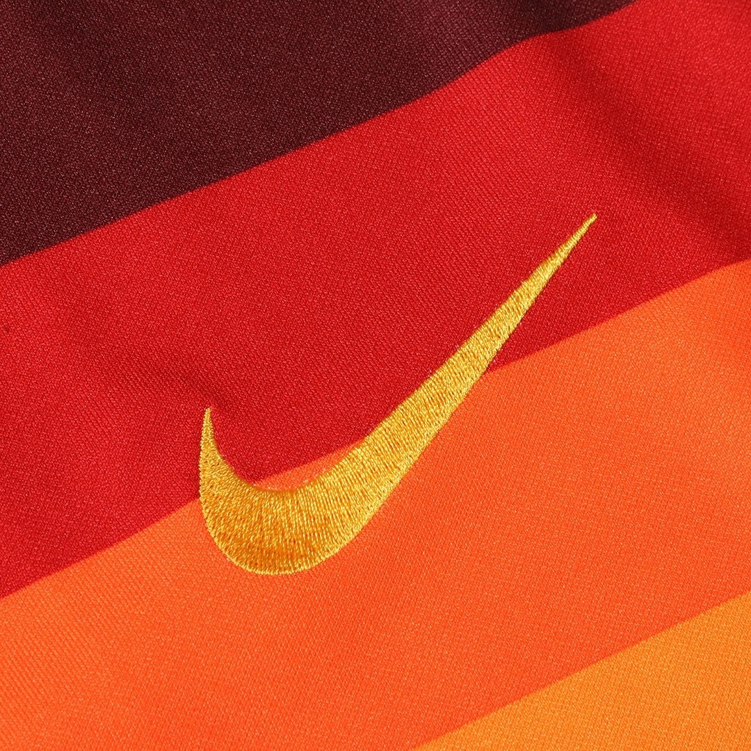
The iconic ‘lollipop’ kit hasn’t just been replicated for the new kit, however. It is a modern update, a stylish refresh. The key difference being in the positioning of the stripes, which are lower down, and number four in total (there is also no white, unlike the original). The addition of a smaller, thinner yellow stripe at the bottom is still something of a mystery (and has been annoying designers on twitter). The bottom two stripes are also different sizes which is a bit off-putting (although kit expert Phil Delves has a theory), and they are also different yellow colours from the yellow of the crest (making for three yellow tones, one orange, one red, all on a dark red maroon base, with a even darker maroon panel on the top shoulders area and cuffs on the sleeves). Perhaps the intention was to have as many colours as possible to amplify the lollipop gradient effect, but it does seem a tad excessive (click on each image below to see in more detail).
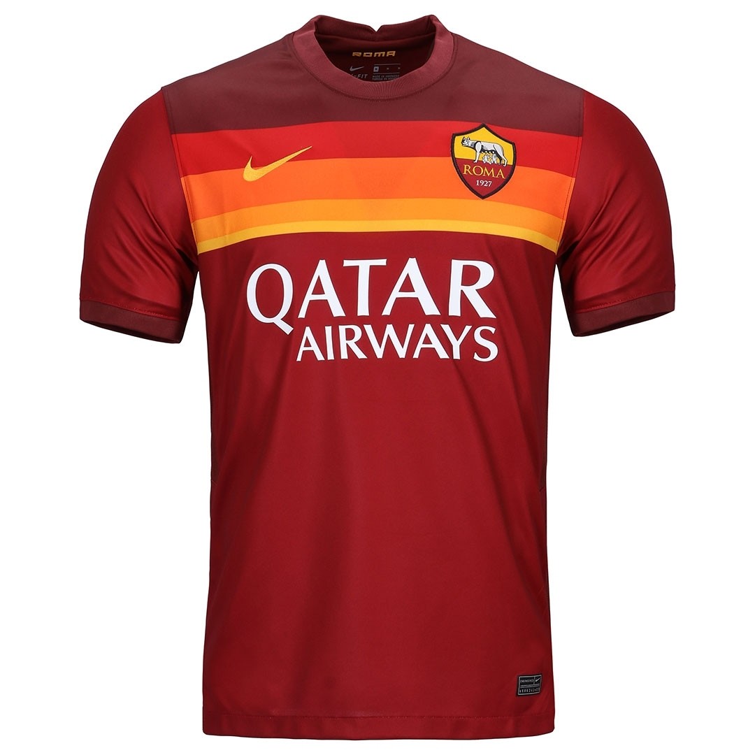

“This is a modern interpretation of one of Roma’s most famous and unconventional kits ever,” said Scott Munson, VP Nike Football Apparel. “We’ve taken a linear gradient striped design, using a very traditional club color palette, to create a kit that we hope the team and supporters will wear with great pride.”
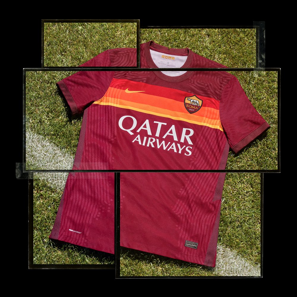
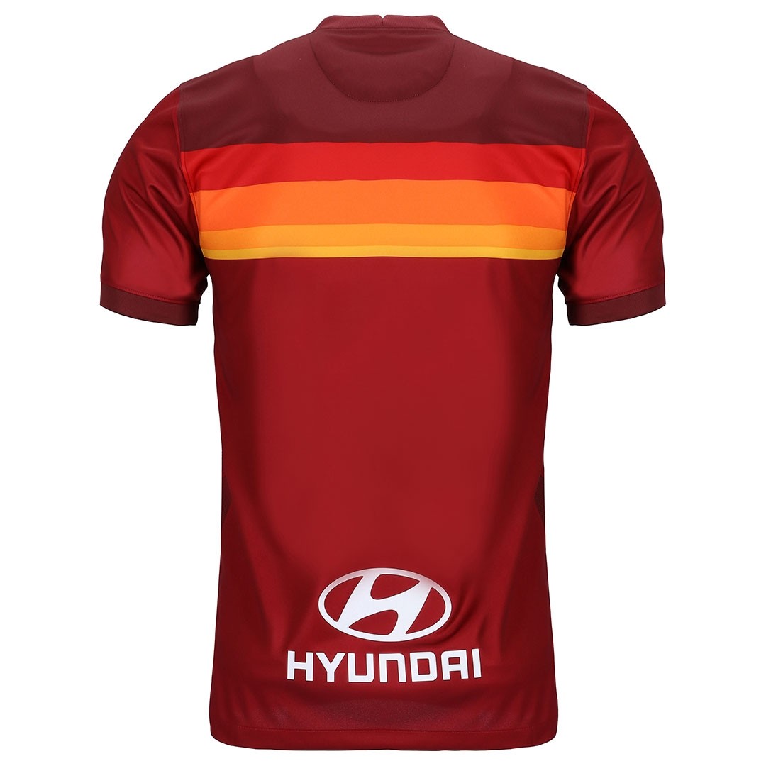
The addition of the smaller yellow stripe also slightly throws the position of the club crest and Nike logo, which aren’t centred to the overall stripes. The stripes themselves continue on to the back of the shirt, which is a really nice addition (although it remains to be seen if this will be allowed in European football with strict UEFA rules on such things). It is a little sad that there is no lupetto crest – as was the case on the ’79 home kit – as an homage to the great Gratton. No doubt it will make an appearance on the away and possibly even 3rd kits.
Nike’s last ever Roma kit is a fine effort taking inspiration from the past with a modern twist. However, as always, the devil is in the details and it feels like there are a few too many of the small components that they have got out of place (and we won’t mention those kit concepts based on the old shirt. Nope, we won’t mention them here at all). In the last two seasons we’ve seen Nike not afraid to take risks with their Roma kits and bringing back some classic looks from the history of Roma, and for that they must be applauded.


This summer marks 40 years since the club’s victory in the 1979/80 Coppa Italia, a triumph that marked a successful end to a memorable two-year period for the club where it wore the famous and original ‘ghiacciolo’ kit.
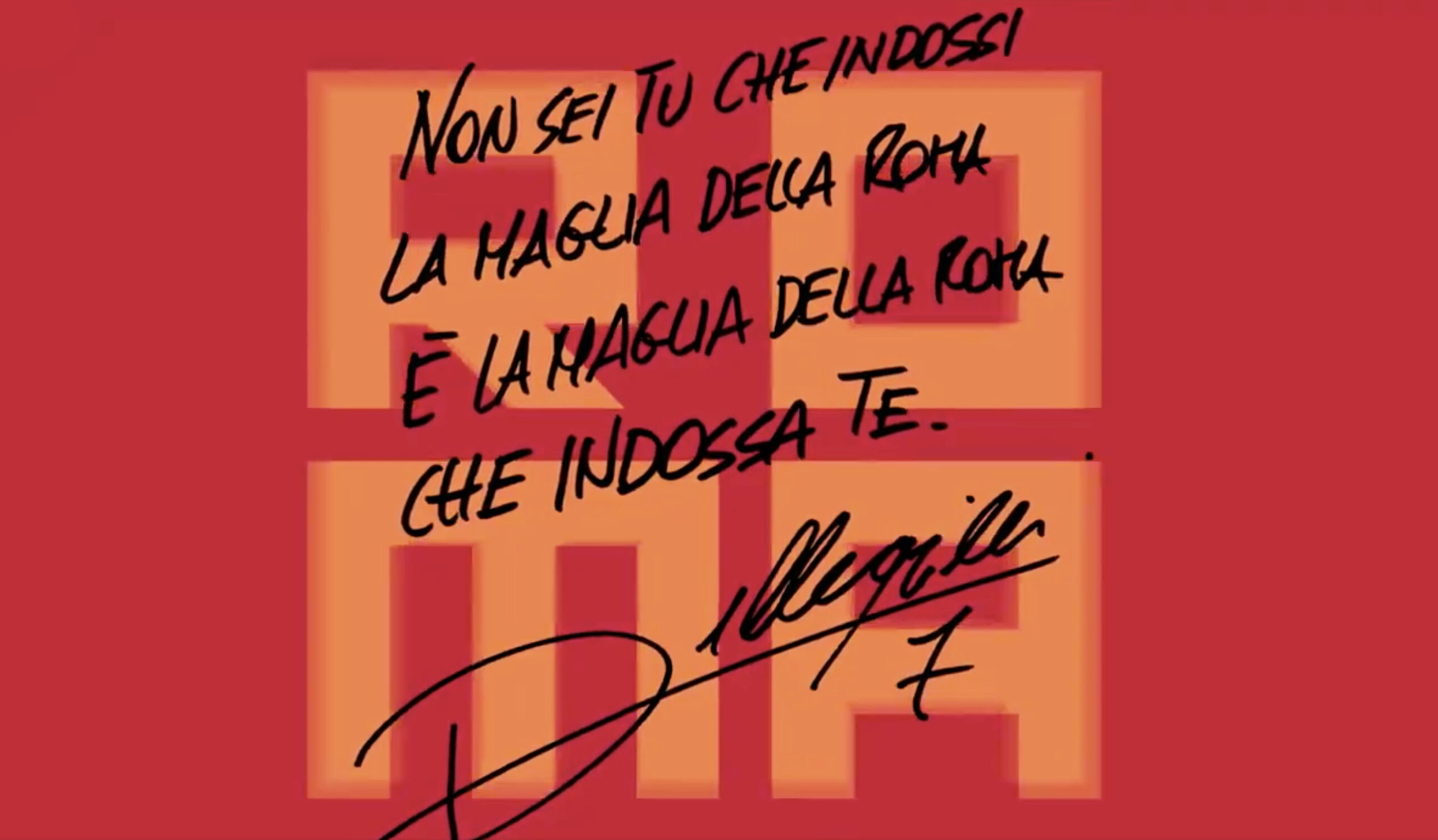
“It’s nice to see a shirt that features Roma’s iconic colors in such an original design,” said midfielder Lorenzo Pellegrini. “To wear a shirt inspired by such a famous kit from the club’s past will be special for both the team and the supporters.”
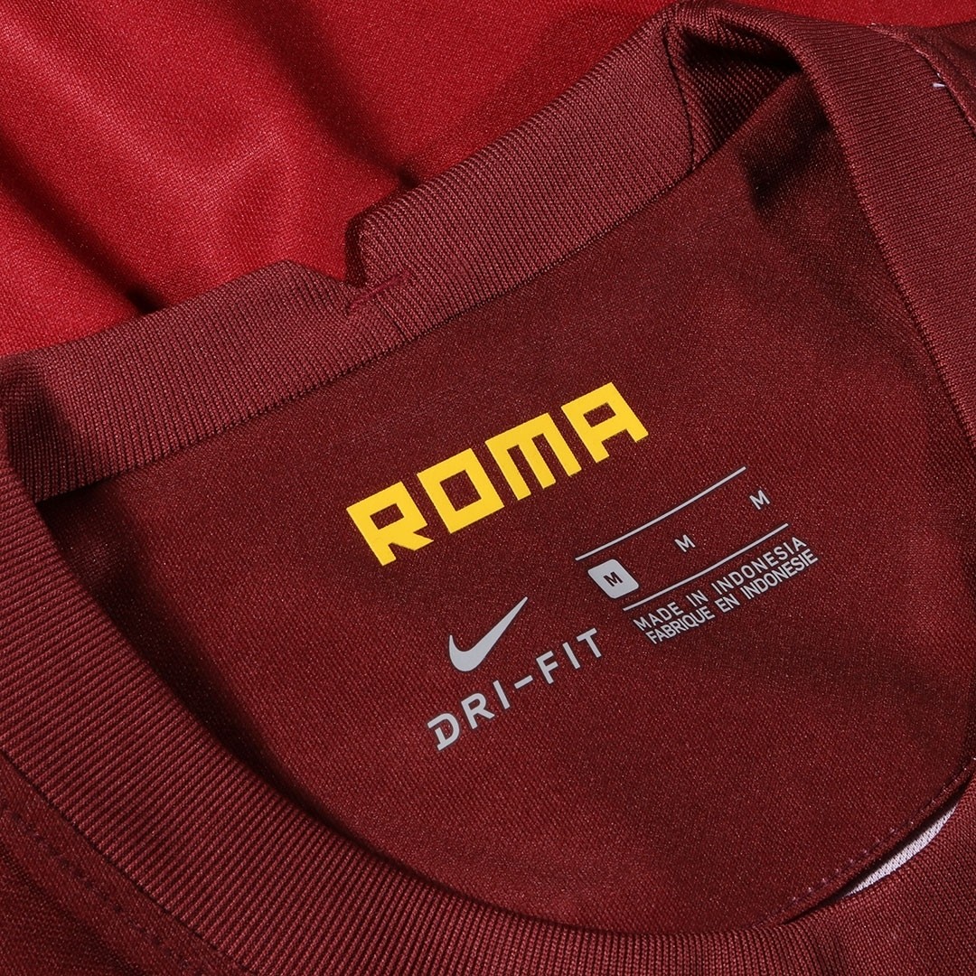
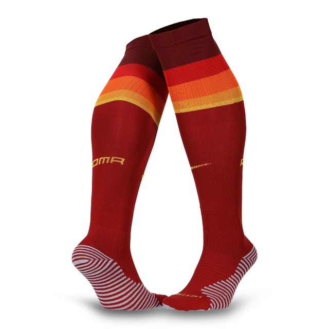
The new standard Serie A font looks impressive on the back of the jersey, and a white squad number and yellow detailing also appear on the shorts, while the deep red socks are topped with coloured hoops to match the shirt design. The word ‘Roma’ appears on the calf and inside the shirt as an added detail – underlining the passion for the club and the city.


To buy the new AS Roma 2020/21 home kit visit ASRomaStore.com
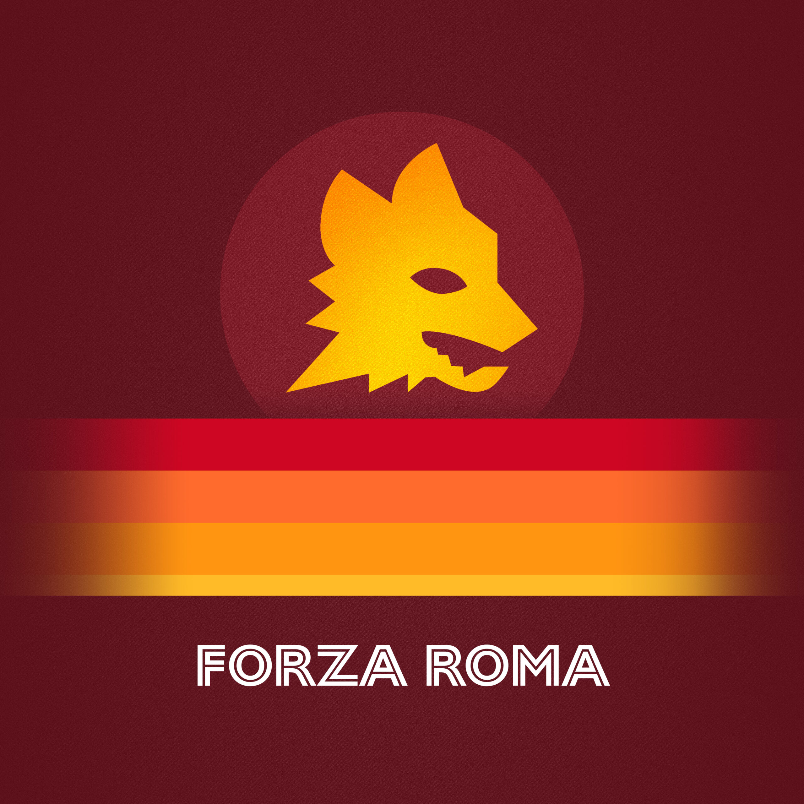
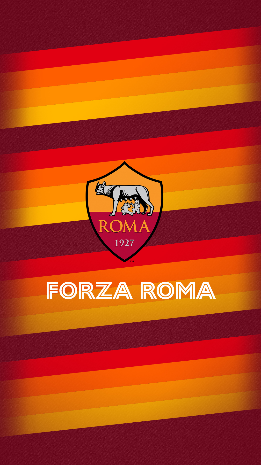
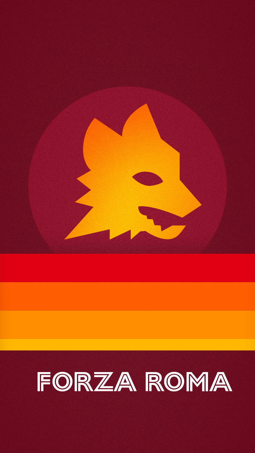
New wallpapers
Roma 2020/21 wallpapers by Forza27, various sizes:


Links / further reading:
• ASRoma.com official release
• Buy it now on the official ASRomaStore.com
• AS Roma 2019/20 Home Kit Overview
• Ranking all AS Roma’s Nike kits
