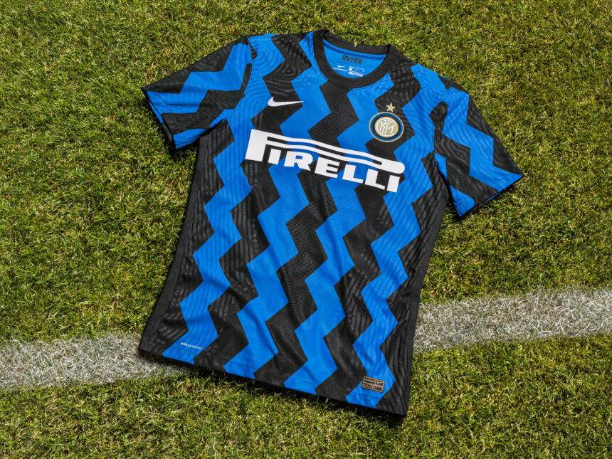
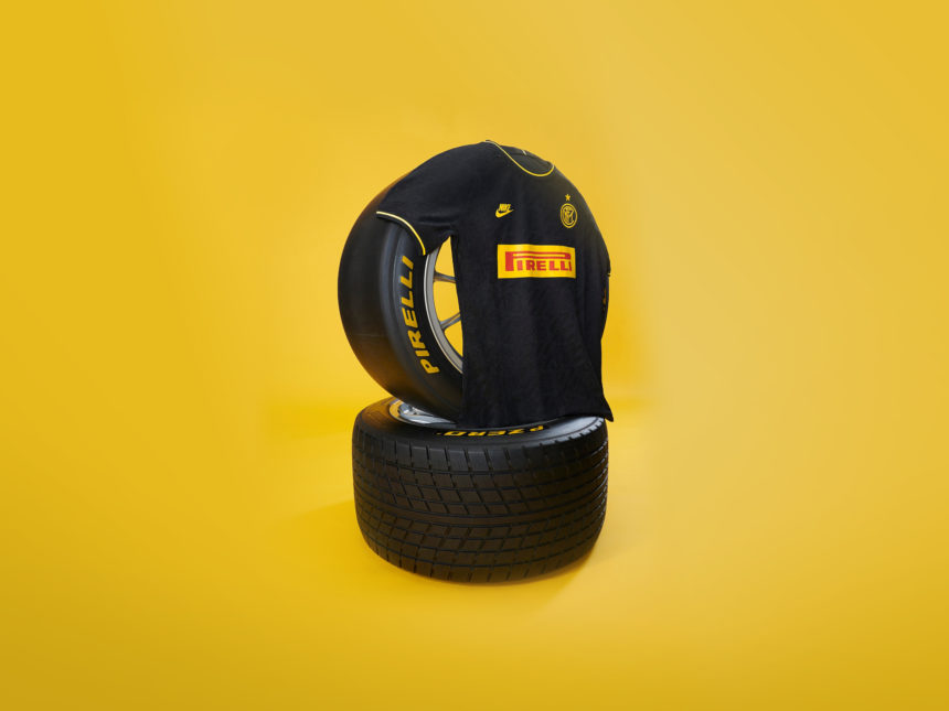
Following on from Inter’s new jersey release, Inter have released a new typeface as part of its ongoing rebranding efforts.
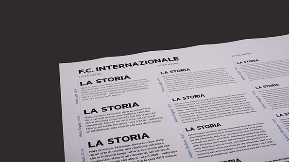
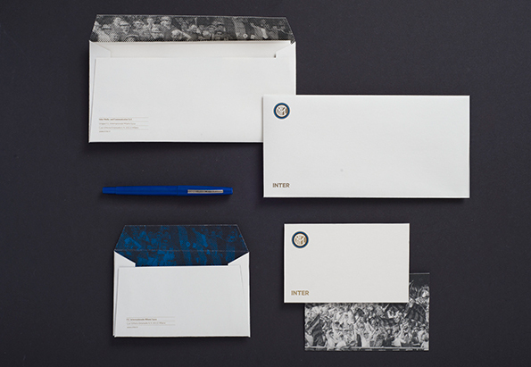
Designed by Milan studio Leftloft, the new bespoke serif typeface is part of an new style guide for use across print and digital. Speaking in an interview with ItsNiceThat.com, Leftloft art director Francesco Cavalli says:
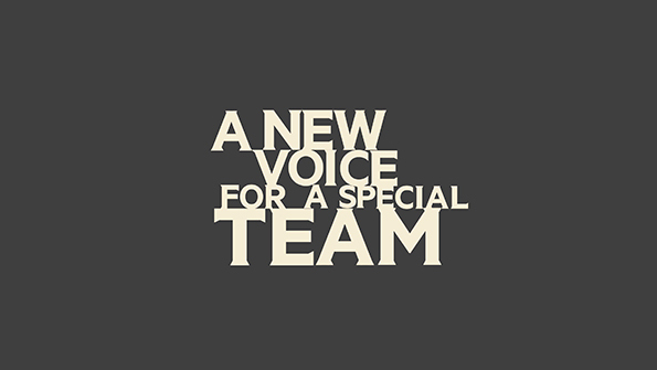
As a result of the club’s strong relationship with its past, we decided sans serif fonts – which are typical in sports teams’ identities – were not exhaustive enough, and we tried to find something more decorative, but equally sporty.
We asked type designer Kris Sowersby to make a couple of versions of his metric font, starting from our sketches to add little serifs and develop the INTER Metric lettering.
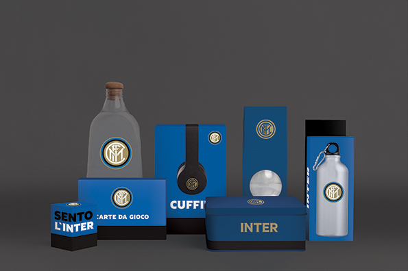
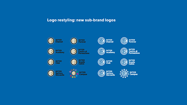
The rebranding affects millions of fans and about a hundred companies from partners to sponsors who will be using the new material and the style guide.
It is not possible to have direct feedback right away. I think the rebranding could be compared to a new building – you can’t know how well it works until you live in it for a while.
See the full interview with ItsNiceThat.com here.


