
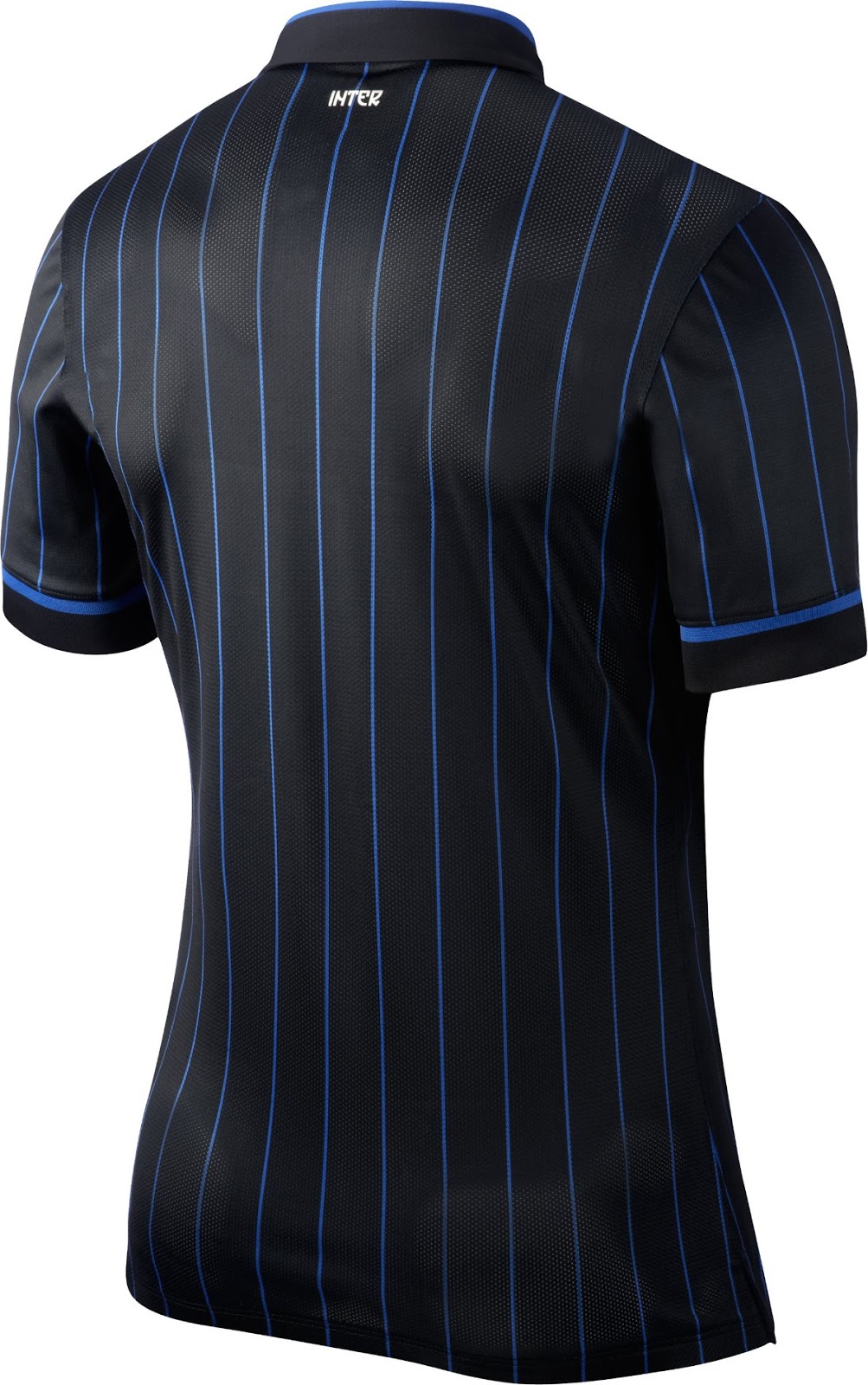
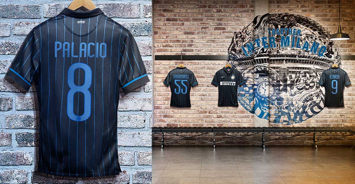
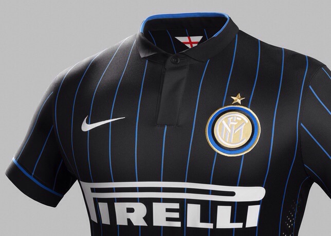
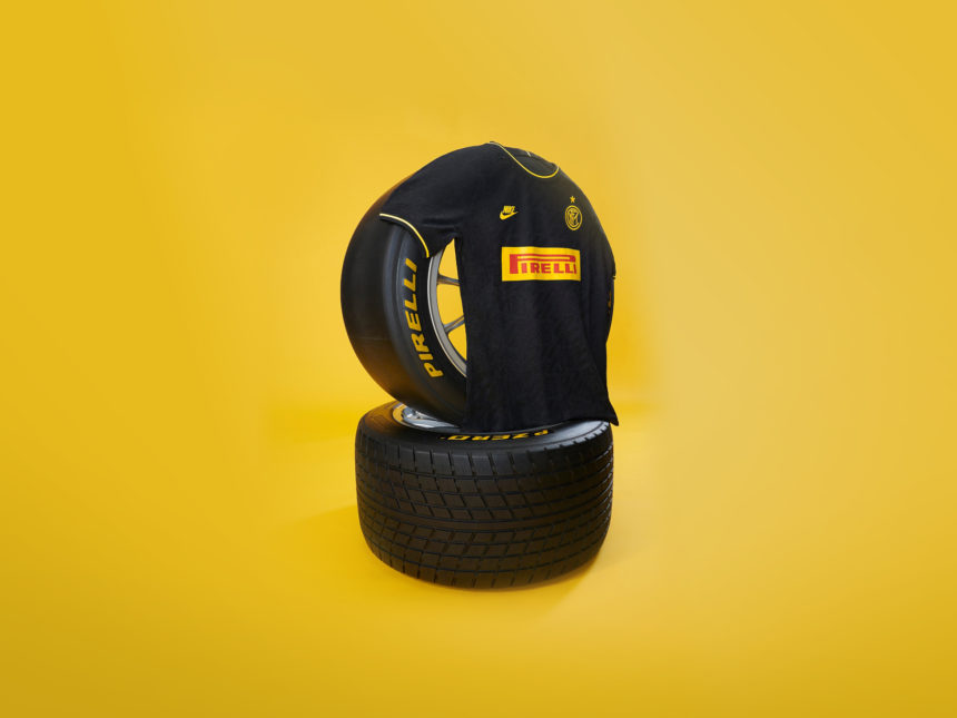
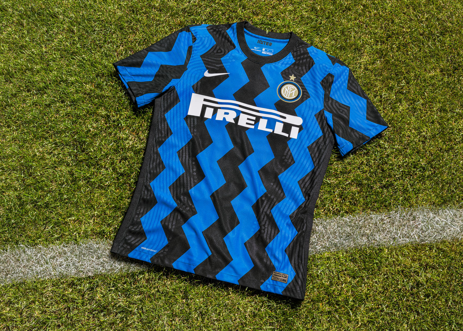
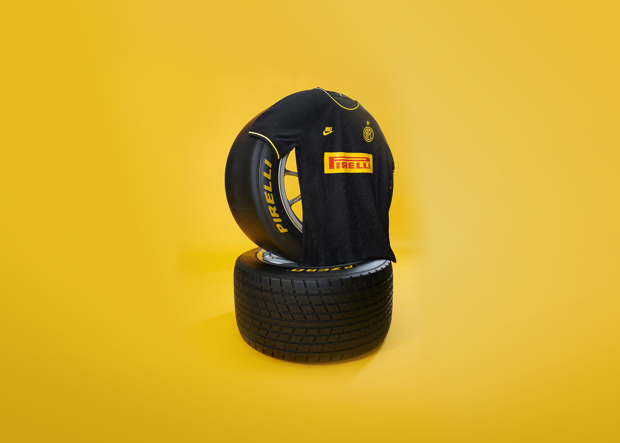
FC Internazionale Milano have released their new jerseys for the 2014/15 season, as well as new updated club crest (see below). The well known black and blue (nerazzurri) vertical stripes have been replaced with a black-dominated kit with 13 slight blue pinstripes. The design is certainly pleasing on the eye, but it is a radical new look for Inter, and making such a dramatic change from tradition can always be met with a backlash from fans.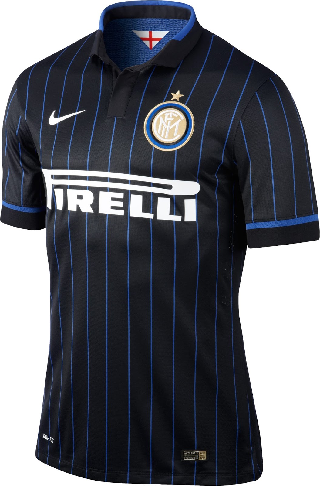


Inter also released a new club logo – similar to their previous version minus the star and two outer circles – through a rather unusual statement on the club’s official website read:
“Try and picture the scene. Your wife smiling at you, or your husband hugging you. A friend you can count on, a dinner in a special place. Imagine music, art. Imagine the best goal Inter have ever scored, the game that gave you the biggest thrill. Imagine it. The best ever. Now that those sounds, tastes and colours are dancing in your head, now that you’re thinking about the best thing ever, think of it in terms of the Nerazzurri. In terms of Inter. The team that makes you heart beat faster.
“A picture is gradually filling your mind, right? First a few simple lines, then circles come together and finally a star. It is starting to take shape. “It” is our new logo, now part of our team. Our “corporate identity” to use the appropriate jargon. An image which will be used everywhere: in our communications, on the team bus, at the academy. One voice for a special team. A team that will be Milanese and international. Fair and surprising. It will be legendary just as it always has been. Imagine it. Then look at the new logo. You’ll notice they’re much the same.”
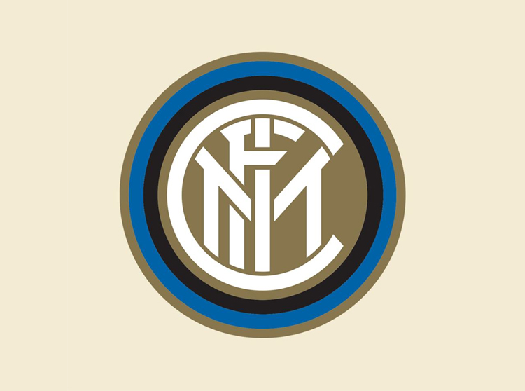 The new Inter logo, based on original design by artist Giorgio Muggiani in 1908. See the older versions here
Inter rebranding in further detail, also from their website:
Here are all the changes: the star reverts to its original meaning and will be, as ever, on the shirt.
MILAN – One voice for a special team. FC Internazionale now has a new look. The logo has changed and is joined by a new corporate identity. It will be seen everywhere: from the website to the first team. From the youth academy to the team bus. A new logo, as we were saying, but also an exclusive font, with official lettering, new packaging for all our products, as well as an innovative online style guide featuring collections designed for Interisti from all over the world.
The whole project bears the mark of Leftloft, the design studio that has been in charge of the team’s image since 2010. Here are details of the new features:
- The logo has been redesigned and is still inspired by the 1908 logo which has come back into use over the last few years.
- The crest has been modernised from every perspective: the lines have been simplified, there are fewer circles now surrounding it and the dimensions have been balanced for enhanced recognition.
- The star has gone back to representing the number of league titles won and is only mandatory on the shirt.
- The gate-like font bearing the team’s name has been removed.
- Over 1,000 products have gone to market with a new packaging devised for all types of product. One voice for a special team. And from today, even better than ever.