
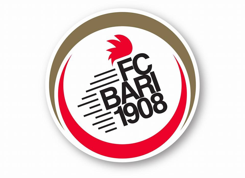
 FC Bari 1908 recently unveiled their new club crest, launched by new owners made up of a consortium of businessmen headed by the Matarrese family. I Galletti are a club with a proud history and tradition, yet were recently close to bankruptcy only to be saved by the consortium when the club went up for auction. (see #compratelabari)
The new crest aims for a more modern and simplistic approach – tilted to the side to represent the new direction of the club – but the most controversial feature is the removal of the much loved cockerel of the previous crest (see below), which was designed by the famous Italian designer Piero Gratton. The cockerel (i Galletti , the clubs nickname) was a very unique logo which was instantly recognisable, and there is disappointment from Bari fans that it has been ditched, although the red ‘hair’ shape remains.
The new circular shape represents the Halo of San Nicola, intertwined with the colors of the city, white and red (i Biancorossi).
![]() Press release detailing the various elements of the new crest
Press release detailing the various elements of the new crest
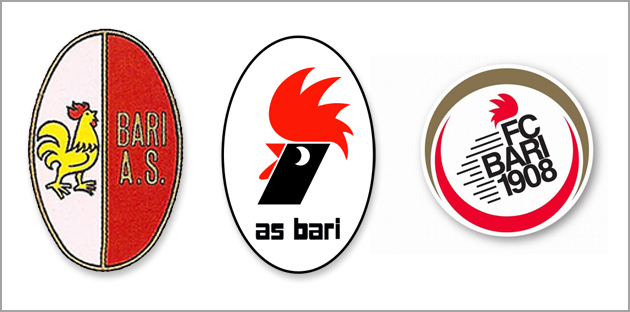 Bari’s crests: the oldest on the left, designed in the 1930’s; the much-liked ‘cockerel’ in the middle (1979); and the latest version
Whilst the new crest may may have a more modern feel, you can’t help but feel that the new owners at Bari have missed a beat in removing the cockerel. The instantly recognisable red and black cockerel – designed by Piero Gratton, who also designed AS Roma’s famous Lupi crest – represented not only Bari, but also the region of Apulia, and you feel the club has not adequately grown and marketed that as its symbol and brand.
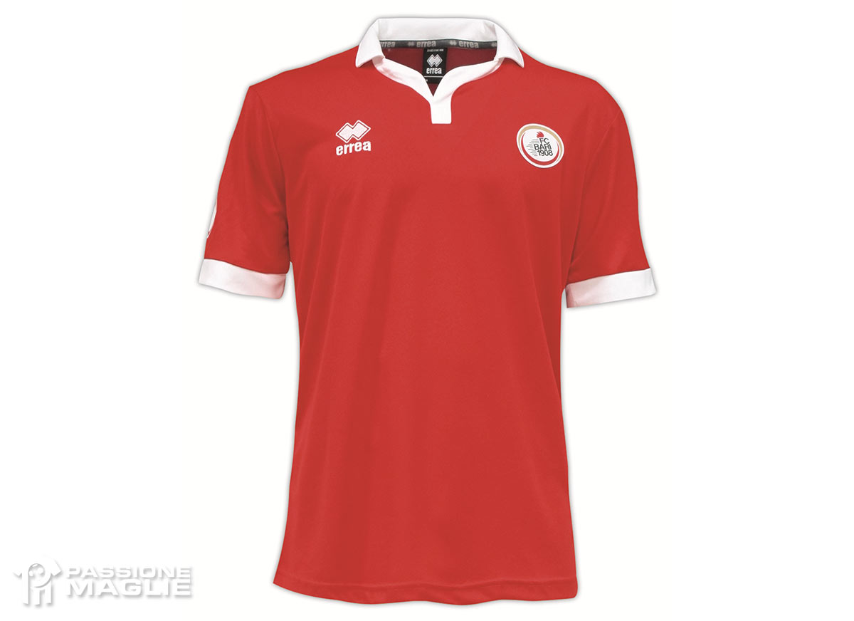
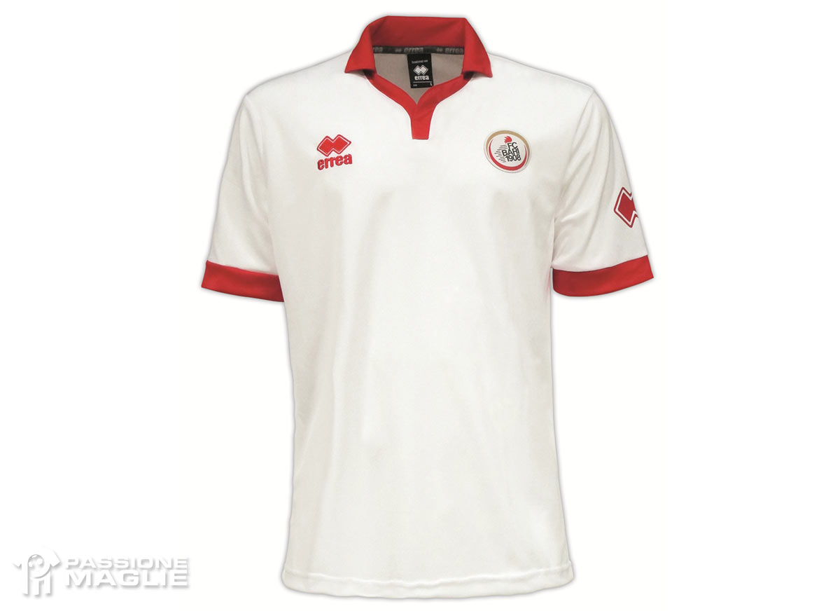
NEW: Bari’s three jerseys for the forthcoming 2014/15 season (via www.passionemaglie.it):
